PORTAL - Portal
Powered by
| Project Links |
|---|
| Software GitHub Repository https://github.com/ds2-eu/portal |
| Progress GitHub Project https://github.com/orgs/ds2-eu/projects/11 |
General Description
To provide a user and developer friendly portal allowing dataspace participants to register and select DS2 modules which can then be packaged into a IDT environment subsequently deployed by participants enabling both In-Data Space and Inter-Data Space operations. As such it includes functionality for developers to include modules, users to find those modules, to trigger the packaging through links with the containerisation module, as well as supporting functionality for dataspace support, dataspace resources, registration and identity management, and administration. It also provides support for the Data Marketplace.
The portal will operate in the DS2 cloud hosted by i4RI. Parties interested in DS may register – this includes participants, dataspace governance/operators, DS2 module developers as well as, potentially, service intermediaries. Developers will provide modules to the portal marketplace which can be selected/purchased by participants. Selected modules will then be downloaded and installed by and at a participant IDT. All parties involved will be granted unique IDs including DS-Pair IDs where DS’s agree to cooperate. If manpower resources allow ,a subcomponent will also support user-developer and developer-developer interactions as well as additional static resources such as useful materials or links to IDSA etc. The portal will run on the DS2 platform as a central node but in itself will not be involved in any participant-participant process either at the control or data plane levels. It operates at Tier 1, so is not a “module” in-itself, even though it will be deployed and run on top of IDT like a module, so participants would not deploy it. However, conceptually it could be run locally. It could be run by any one as an additional service – for example dataspace operators. Its main interfaces are to the Containerisation module for module description and packaging, IDT for deployment, the Platform where it is both deployed and will interface to some system modules, and the Data Marketplace which uses it for base marketplace functions.
Architecture
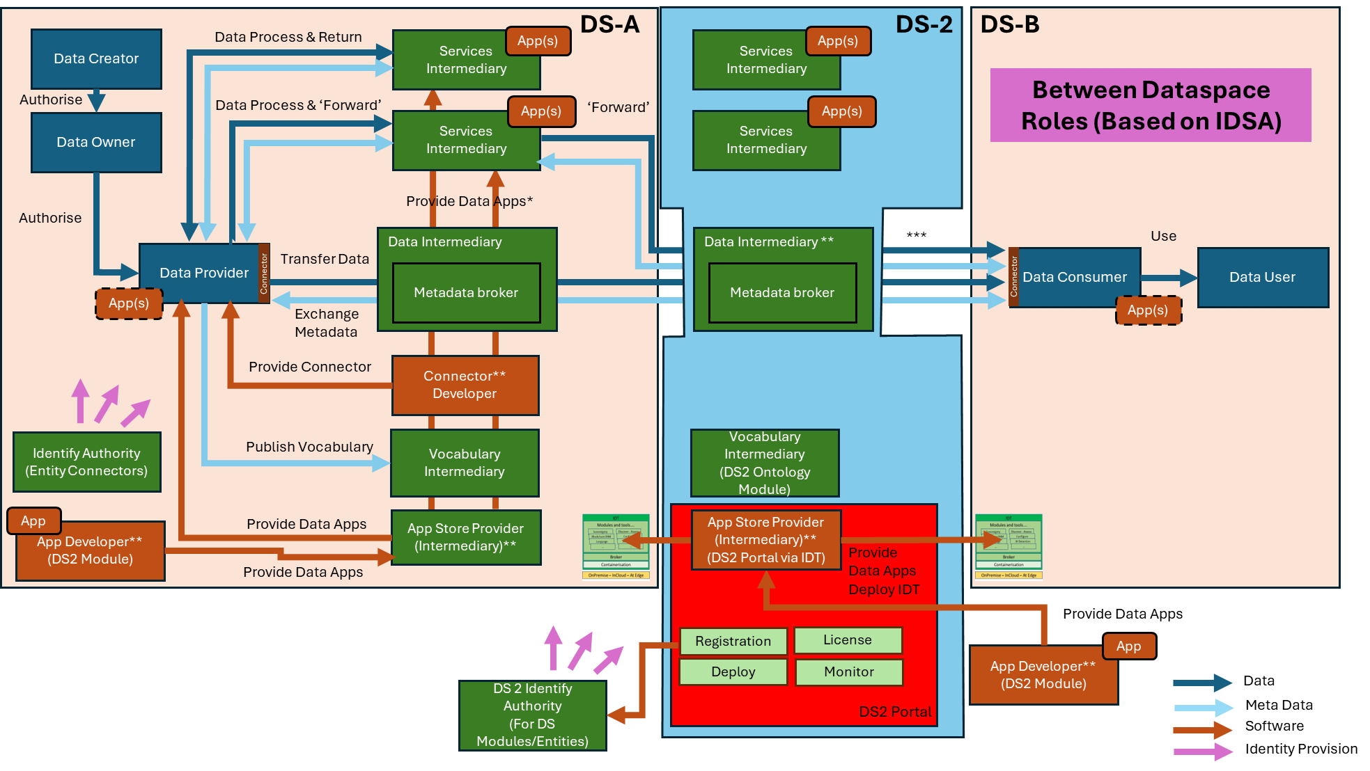
The figure below represents the module fit into the DS-DS environment.
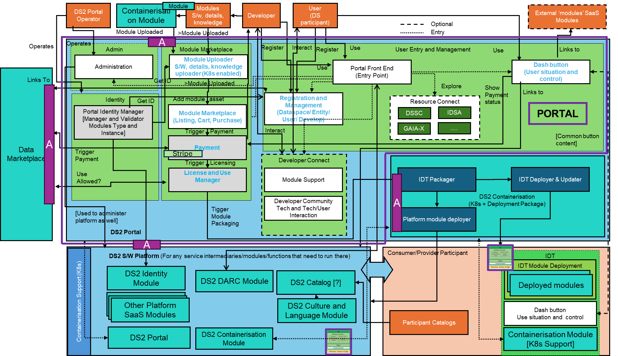
The figure below represents the actors, internal structure, primary sub-components, primary DS2 module interfaces, and primary other interfaces of the module.
Component Definition
This module has the following subcomponent and other functions:
-
Portal Front End: This is the initial web front end entry point seen by any user of the portal, regardless of participant type or if an external party (eg developer). If unregistered, it directs them to the Registration and Management component and if registered a login process follows. Dynamic menus then allow users to navigate to the elements they wish to see and have access for and as such there is an inferred link to all subcomponents with some form of UI. Of particular relevance is the Dashbutton which is a kind-of mini-Portal Front End embedded in all subcomponents and modules including the Portal itself.
-
Registration and Management: This allows the registration of any actor which wishes to take advantage or use DS2. This includes human actors such as user’s requiring IDT/modules and developers through to system actors such as dataspaces. This will be a customised version of ICE’s existing portal registration system. It’s primary link is to the DS2 Identity Manager.
-
Dash button: The Dashbutton is a DS2 library feature used by most modules and is a dynamic shortcut menu to things of most relevance to the user (eg mainly their installed modules). It allows users to quickly get awareness of their personal DS2 environment as well as control it. The Dashbutton dynamic is detailed within the IDT Module. The base functionality of the Dashbutton exists now but needs to be highly customised for the DS2 environment. It relies on embedded HTML vs an API and enables a holistic environment for DS2 in an easy way. It is detailed in the IDT module.
-
Resource Connect: This will have no deep functionality but allows the users to navigate to further web/document/video type resources both within DS2 and externally (eg IDSA). For example, to read more technical details, look up example dataspaces or any other material. This component is an “if-time-allows” option.
-
Developer Connect: This is intended to simplify casual chat-like interaction between users and developers or in fact any set of participants subscribed to DS2. For example, for support or to discuss new ideas. If included it will be based on existing third part components. This component is an “if-time-allows” option.
-
Module Marketplace: Listing, Cart, Purchase: DS2 modules need to be selected from a catalogue of all modules, purchased (which may be for 0 EUR), and licensed which then makes them available to be packaged into IDT. Except for the latter this is classic marketplace functionality and is mainly configuration of ICE’s existing marketplace module. Its primary links are to the Module uploader to populate its shopfront and once a module is ’purchased’ the License and Use Manager.
-
Module Uploader: Beneficiaries (or third parties) develop data-orientated DS2 modules which can be put on DS2 Marketplace. A main link is to the DS2 Identity Manager to give unique identities to the module uploaded. This subcomponent ensures all relevant information is provided and packaged in the right way. This includes software, module details (eg price, licenses, description, logo...), and accompanying knowledge (eg How To’s, Videos…). It ensures a module is K8s/Helm compliant so that it can be potentially packaged into IDT. It will be based on ICE Asset upload being customised for the DS2 environment and all modules must confirm to its needs.
-
Payment: Once agreed the product is paid for and both the portal and the developer compensated. An existing payment service (stripe) will be used and a cart-mediator service is used to link to that (strip link is not shown in architecture). This service will also be used by the Data Marketplace
-
License and Use Manager: Following potential purchase from the marketplace the asset is then licensed for use (fixed licenses, subscription etc – however developer determines) and a Payment is then due. Once licensed it becomes available for the Containerisation and Deployment grouping to either issue a new IDT or to upgrade and existing IDT. The components is based on existing ICE Marketplace technology upgraded for DS2. Other modules can also use the licensing system – eg the Data Marketplace (TBD). Note that on first use core modules such as containerisation will also be packaged
-
Administration: A UI for Portal (and Platform) administrator to use to configure other elements and functions of the portal based on access credentials.
-
Portal Identity Manager: Provides identities for actors (parties and modules) relevant to the Portal. All DS2 users must have a DS2 ID, as should Dataspaces, and Dataspace Pairs. The Portal Identity Manager will where necessary interface with the DS2 Identity Module (IDM) to validate participant IDs which will run on the DS2 Platform
-
DS2 Containerisation and API: This provides two basic services to the portal: A) Assisting and ensuring a developer uploads a containerisation compliant module. B) Once modules are selected and licensed, they can be packaged and deployed via this module to downloadable/upgradable IDTs
-
DS2 S/W Platform and API: This platform is available to all modules and is the cloud home of the Portal as well as the Portal hosting an administrative interface to configure it
-
DS2 Data Marketplace and API: The cloud base data marketplace may take advantage of some of the portal common administration function – user management, licensing, payment
-
DS2 IDT Broker: The licensed modules are packaged via DS2 Containerisation and deployed as a bespoke IDT to the participant
-
DS2 Portal Operator: This represents the administrator and operator of the system who use the Administration UI
-
Modules, s/w, details, knowledge: This represents the upload of the module and accompanying information to become an asset in the portal which can be later explored and purchased. The upload is to the Module Uploaders.
-
Developers: Technicians and business partners representing a developed module to be uploaded
-
User: Any participant of any data space, or future potential participant who wishes to explorer/download modules available
-
External Modules: Other modules which could be applicable to show on a users Dashbutton
Screenshots
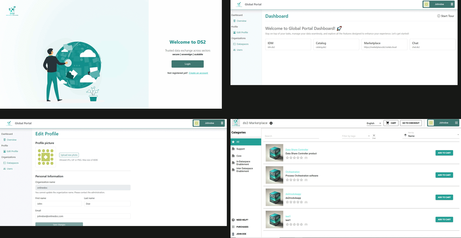
Commercial Information
| Organisation (s) | License Nature | License |
|---|---|---|
| ICE | Open Source | Apache 2.0 |
Top Features
- Organisation Registration and Management: The Portal provides the functionality to register an organisation in DS2 and manage its profile
- User and Role Management: Create additional users and roles to the organisation
- Main DS2 Entry Point: The Portal is the UI main entry point to DS2
- DS2 Navigation: Allows seamless navigation between intermediary modules in the DS2 Cloud Platform
- Global and Local Portal: The Portal has two different views, the Global Portal running as an intermediary service in the DS2 Cloud Platform and the Local Portal which is meant for the IDT as the IDT Portal
- Dash Button: A web component to be integrated by all modules that provide the interface to the DS2 security and identity system and allows module navigation
- Developer Access: Generate API Key to use the Portal API for integration
- Portal Marketplace: The Portal includes a fully featured Marketplace, which could be considered a module on its own, with functionalities to publish and purchase modules, module search, feedback and ratings, flexible license models, secure payment integration, etc.
- GitHub Backend Storage: The Marketplace feature is backed by GitHub storage, meaning that modules and container images are stored in GitHub
- Containerisation Integration: The Module creation view of the Containerisation module is integrated into the Portal
How To Install
Even though the Portal (Global Portal) is a DS2 intermediary service, and users don't need to install it, it is packaged as a regular DS2 module and can be installed on top of the IDT, same as the Local Portal. The Marketplace is also installed as an additional module. In addition, the Dash Button is a web component that needs to be integrated in all DS2 module UIs. Details on how to integrate it are explained next.
Requirements
- Docker
- Keycloak (to be included in the module package for DS2 Containerisation)
- Linux (Ubuntu 20, 22)
Software
N/A
Summary of installation steps
Portal
- Run a keycloak instance or use the ds2 one (recommended)
- Pull the docker images from the DS2 GitHub Container Registry
- Run the containers from the docker images: Portal API and Portal Frontend
Marketplace
Dash Button
-
Add script file path to index.html
-
Add the font-awesome library (starting from v0.0.16)
-
Configure according frontend framework ie. Angular ...
-
Place the web-component button tag at the top of the navigation bar
Detailed steps
Portal
- First, you need to start your own Keycloak instance or use the DS2 version. We recommend using the DS2-based Keycloak instance
- Instructions on using own Keycloak instance TBD
- To use the DS2 Keycloak instance, you just need to configure the URL https://keycloak.ds2.icelab.cloud when running the containers - see next step
-
Pull the docker images form the GitHub repository
You will need to log in the registry using docker login ghcr.io
-
Run the docker images
- The Portal API
docker run --name portal-api -d --restart unless-stopped -p 3000:3000 -e IMAGE_GITHUB_REPONAME="avatar-repo" -e KEYCLOAK_URL='https://keycloak.ds2.icelab.cloud' -e REALM_NAME=ds2 -e CLIENT_ID=portal-api -e CLIENT_SECRET="" -e IMAGE_GITHUB_TOKEN="" -e IMAGE_GITHUB_USERNAME="" -e DATABASE_URL="file:/usr/src/app/data/dev.db" -e GITHUB_TOKEN="" -e GITHUB_ORG="ds2-eu" ghcr.io/ds2-eu/ds2charts/portal-api:2.0.4 - The Portal Frontend
docker run --name portal -d --restart unless-stopped -p 4200:80 -e PORTAL_API="https://portal-api.ds2.icelab.cloud" -e REDIRECT_URL="https://portal.ds2.icelab.cloud/dashboard" -e SHOW_POST_LOGIN_TEXT=true -e DEPLOYMENT_MODE=global -e SHOW_ONBOARDING_MESSAGE=true -e REPOSITORY_API_KEY="" ghcr.io/ds2-eu/ds2charts/portal:2.0.3
- The Portal API
Dash Button
To use the DashButton web component, copy and paste the following script tag into your application's header (head section).
Note: Please refer to the npm package page to find the latest version, and replace
X.X.Xin the import script accordingly:<script type="module" src="https://unpkg.com/dash-button-web@X.X.X/dist/esm/web-compnont.js"></script>Note: Starting from v0.0.16, you need to add the FontAwesome stylesheet file to your application. If your application is already using this package, you can ignore this.
<link rel="stylesheet" href="https://cdnjs.cloudflare.com/ajax/libs/font-awesome/6.7.2/css/all.min.css" />
You can find the NPM package named dash-button-web.
If it is a framework, you will need to configure more options. Therefore, follow the Stencil.js documentation.
- Setup Keycloak Server Application
First, you need to start your own Keycloak instance or use the DS2 version. We recommend using the DS2-based Keycloak instance.
* Option 1 – Use DS2 Keycloak details

  You can use predefined Keycloak credentials to configure DashButton. The required details are summarized below.

  - Keyclaok URL: **https://keycloak.ds2.icelab.cloud**
  - Realm: **ds2**
  - Client ID: **dashbtn**

* Option 2 – Configure your own Keycloak client

  If you use your own version, you need to configure the realm, client, and test users.
  Make sure the client is set up with a **client ID** and that **client authentication is disabled**.
- Configure frontend application
Here, we are demonstrating how to configure the application on an Angular-based application and a basic HTML-based application. If you need to install React or Vue.js, follow the Stencil.js documentation.
First, you need to enable the custom component support feature in the Angular project. To do that, the following code block needs to be added to the src/app/app.module.ts file.
Once the above addition is completed, it is required to import the below module as follows.
Next, you need to put the script file path in the src/index.html file header section as follows.
<head>
  <meta name="viewport" content="width=device-width, initial-scale=1">
  <link rel="icon" type="image/x-icon" href="favicon.ico">

 <script type='module' src='https://unpkg.com/dash-button-web@X.X.X/dist/esm/web-compnont.js'></script>
 <link rel="stylesheet" href="https://cdnjs.cloudflare.com/ajax/libs/font-awesome/6.7.2/css/all.min.css" />

...
After adding the script, you can use the DashButton web component in your application. Most configuration is automatically retrieved from the backend.
Note: From version v0.0.17 onward, Keycloak configuration is no longer required. These settings have been removed from the DashButton configuration and are automatically retrieved from the Portal API backend. Please ensure that the portal-api-url is configured correctly.
-
Configuration options
Attribute Description Type Default portal-api-urlPortal API URLstring`` redirect-uriApplication redirect URIstring`` show-post-login-textSuccessfully logged in shows a custom button messagebooleanfalseauth-methodAuthentication methodstringcheck-sso,(login-required) -
Theme configuration options
Attribute Description Type Default primary-colorSet primary colourstring`` accent-colorSet secondary or accent colorstring`` AuthMethod Using the auth-method attribute updates the application's authentication workflow.
login-required: User is forced to the login screen if they are not logged in.check-sso: User is not forced to the login screen; instead, when the user clicks the login button, they are redirected to the login screen.
Now, you are almost done. In the final stage, you can place the web-component button tag at the top of the navigation bar using the following code block.
Note: Replace DashButton configuration with actual values.
To get the module link for the Dashbutton, use the portal-api-url attribute and provide the Portal backend API endpoint URL. For the DS2 platform, you can use https://portal-api.ds2.icelab.cloud as the Portal API URL..
<dash-button keycloak-uri="http://localhost:8080" realm="demo" client-id="testapp" portal-api-url="replace_url" auth-method="login-required" show-post-login-text="false"></dash-button>
Note: You need to create a new user. Please access the portal and create an account associated with your organization.
Additionally you can test some of the demo applications located in the Portal repository dash-button/demo-app/ folder (see additinal links)
How To Use
The next sections describe how to use the different components part of the Portal
Portal
In order to use the Portal, first navigate to the main entry page at https://portal.ds2.icelab.cloud/.
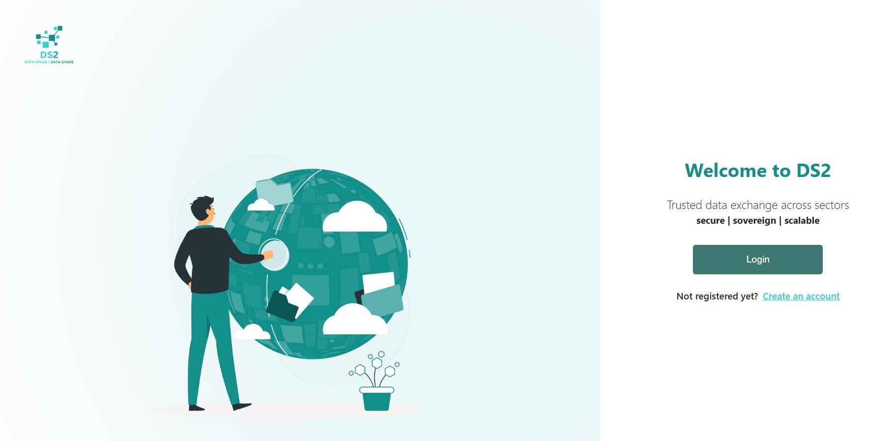
You need to first register your organisation to be able to log in. Click on Create an account and enter the required details.
First enter the name of the new organisation and click Next to check whether it already exists or not in the system.
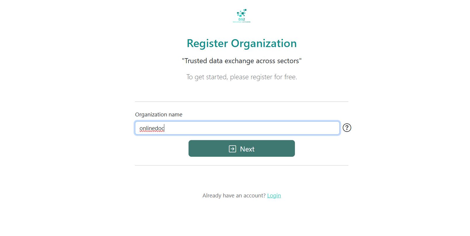
Then fill in all the required details for the organization registration form.

Agree to the DS2 policy and click Register.

After that, organisation is registered.
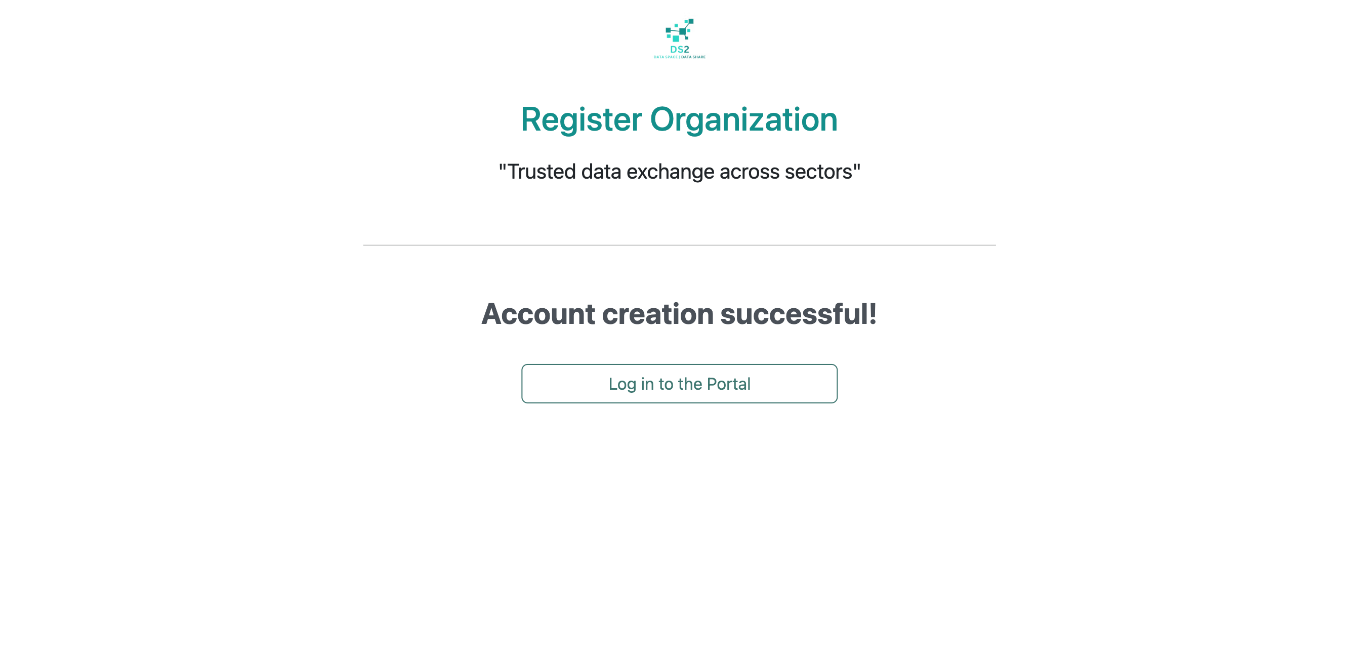
User can now log in with newly created organisation and username.
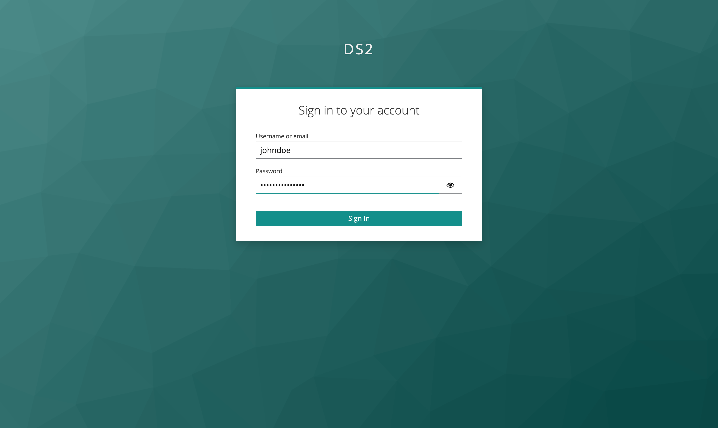
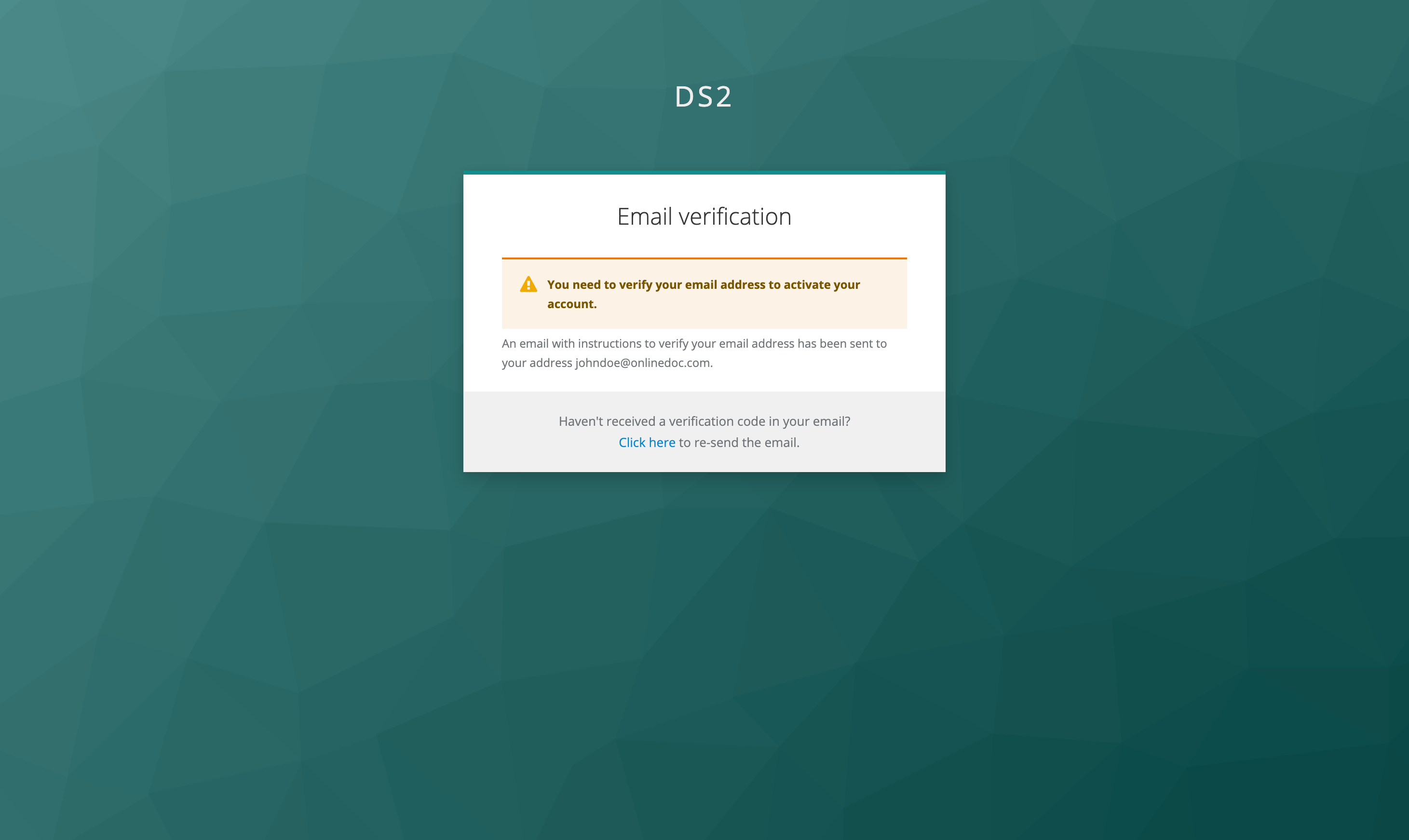
User will receive a verification email upon first login attempt
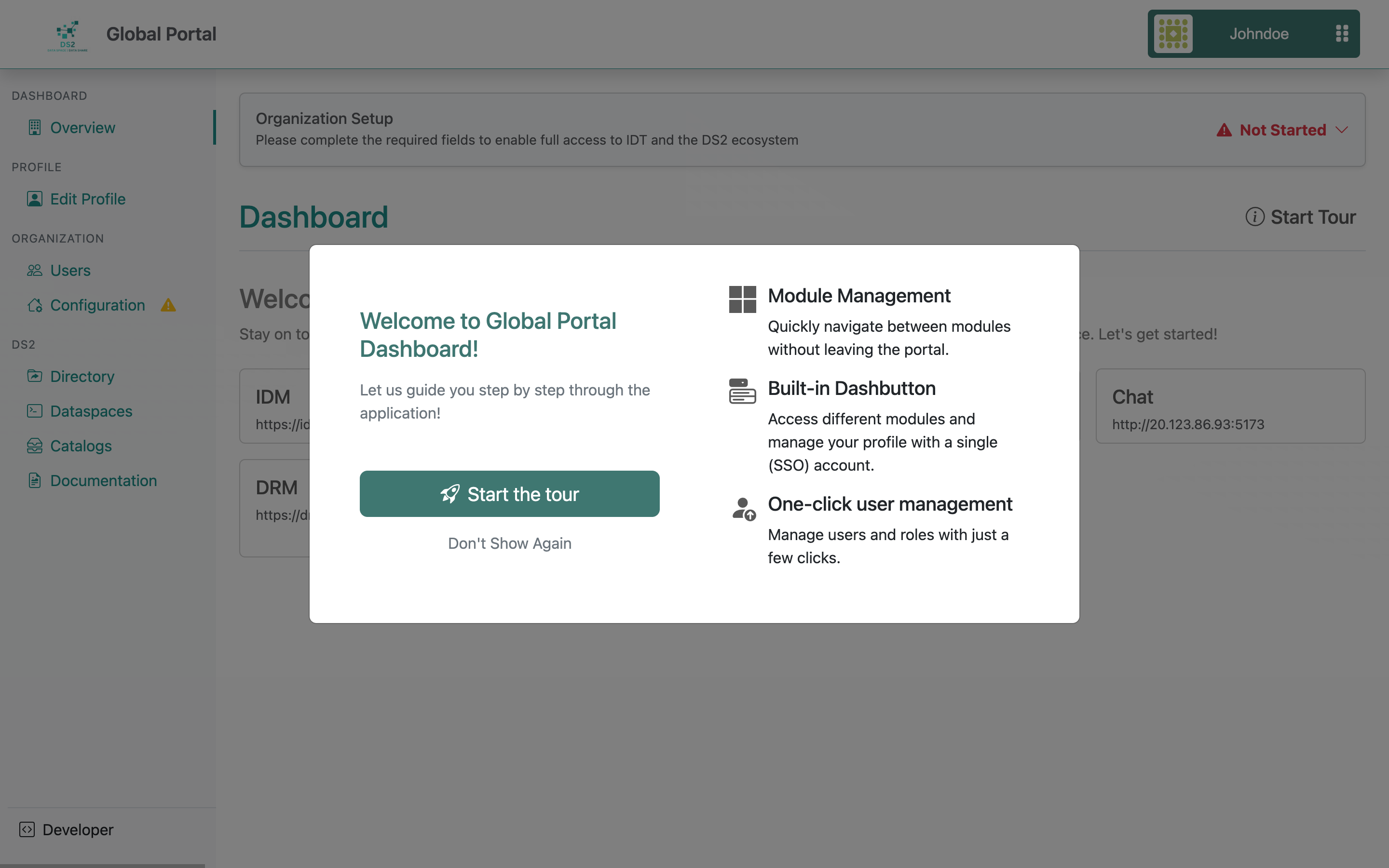
Once logged in there is a guided tour on the different options available that uses can follow.
The main Dashboard of the Portal displays the default central modules running on the DS2 Cloud Platform, including IDM, Catalog, Marketplace, Chat, and more. For first-time users, the Dashboard also highlights any required profile fields that must be completed to enable full access to IDT and the DS2 ecosystem.
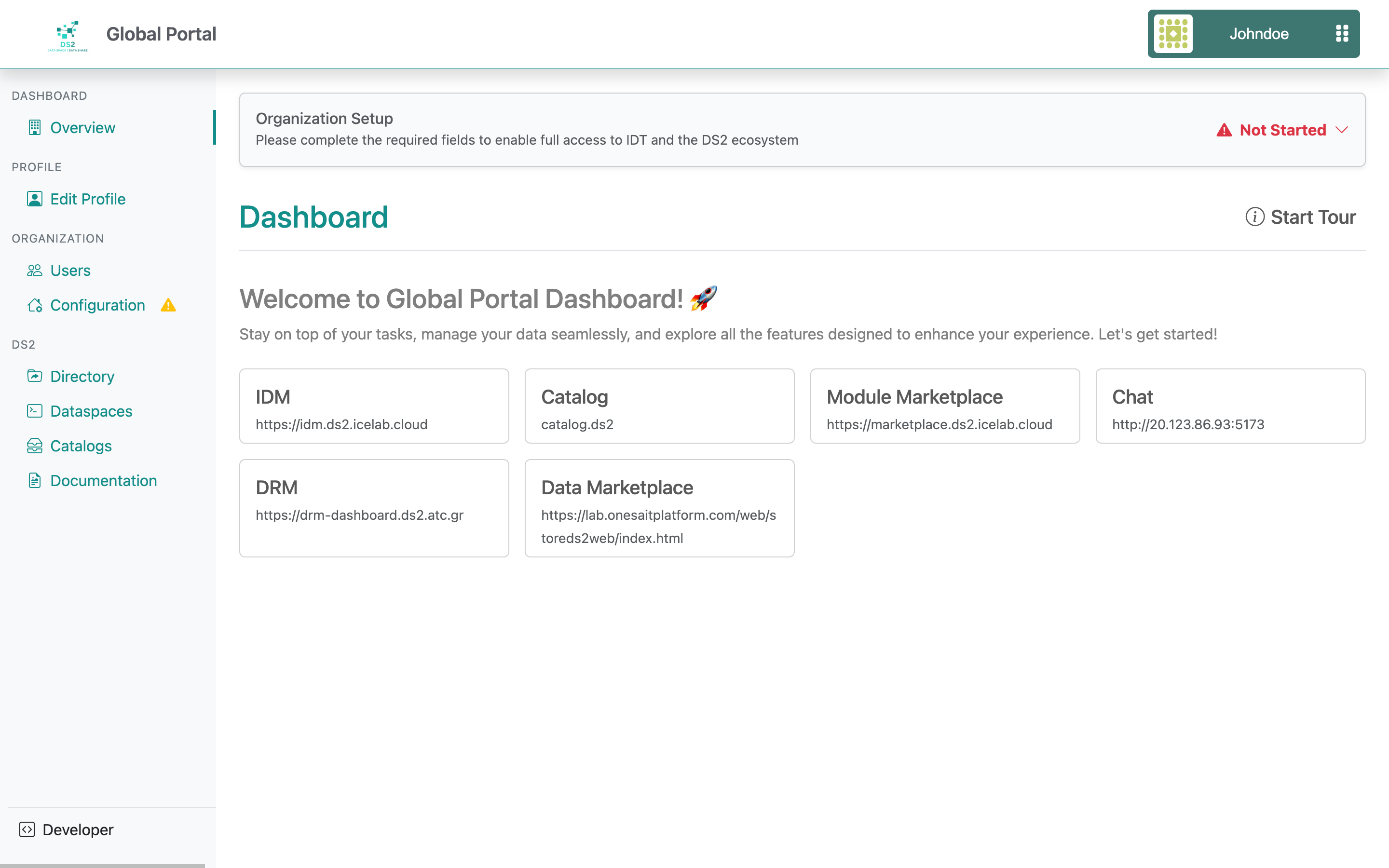
The left navigation menu is organized into four main sections: Profile, Organization, DS2, and Admin. Each section provides access to different Portal features and management tasks.
- Profile – View and update personal profile information.
- Organization – Manage organization details, users, and other organization-related settings.
- DS2 – Access and manage dataspaces, catalogs, and documentation.
- Admin – Available only to administrator users. This section provides interfaces to manage Portal administration features, including dynamic registration forms, Dashboard configuration, policies, DLM settings, and other platform configurations.
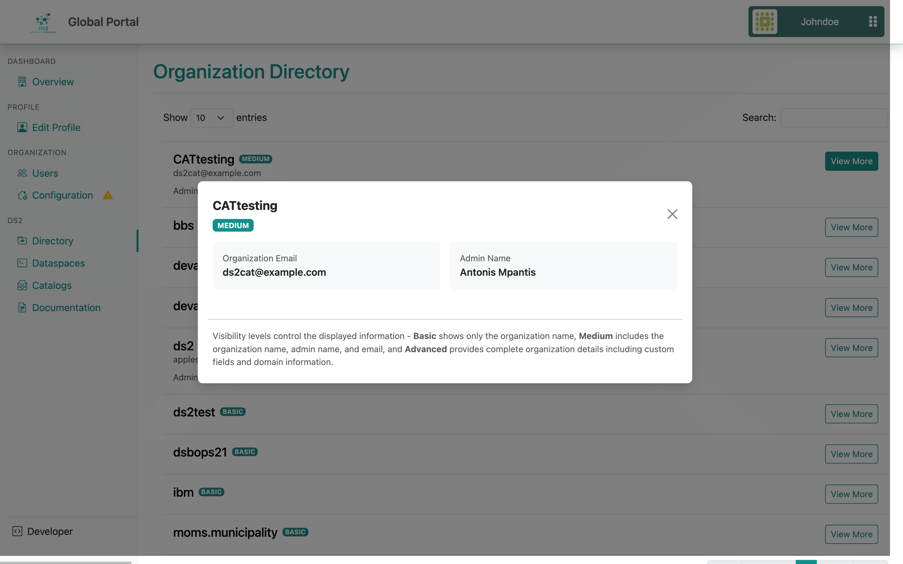
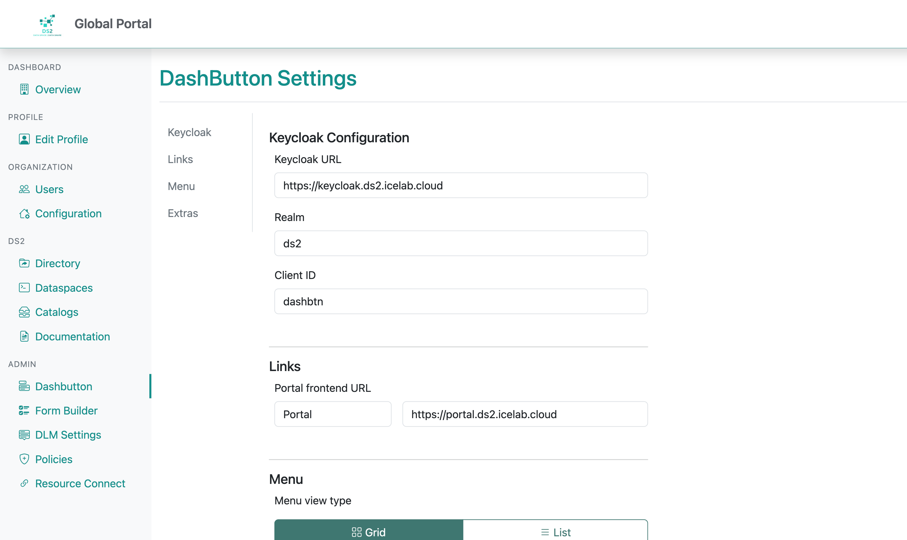
In addition, the Portal already includes the DashButton which is described in the DashButton section.
Marketplace
This guide explains how to use the DS2 Marketplace, for three types of users: Sellers, Buyers, and Admins.
A few terms used in this guide
| Term | Meaning |
|---|---|
| Asset | An item a seller lists for sale, shown on the seller's "Assets" page and in the buyer's storefront. |
| Bundle | A kit of multiple assets sold together as one package. |
| Related Modules | Similar or complementary assets that the seller has linked to their listing, shown to buyers on the asset page. |
| Dev Connect | The support-ticket system connecting buyers and sellers — buyers raise issues from Issues, sellers respond from Requests. |
1. Seller Guide
Sellers manage their listings from the Owner Panel, available after logging in.
1.1 Getting seller access
Seller access is given through the Portal — simply log in with a Portal account that has access, and you'll automatically see the seller menu and dashboard.
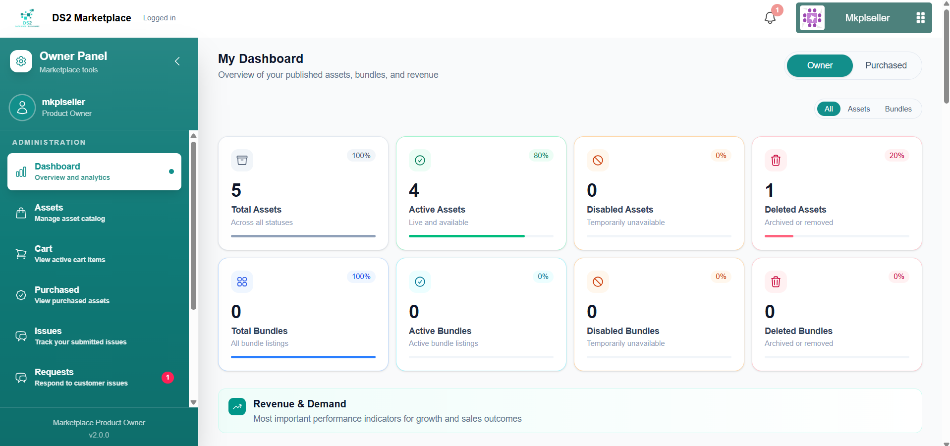
1.2 Dashboard
After logging in, click Dashboard in the sidebar. Here you can see: - Total, active, disabled, and deleted assets and bundles - Monthly revenue and monthly paid orders - Top purchased assets and top revenue assets - Cart-to-purchase conversion rate
1.3 Starting a new asset
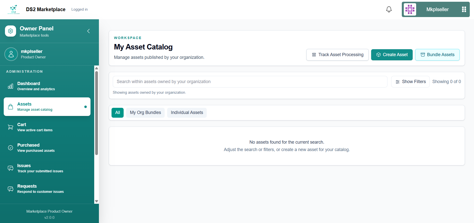
- From your Owner Panel, go to My Asset Catalog, then click Create Asset.
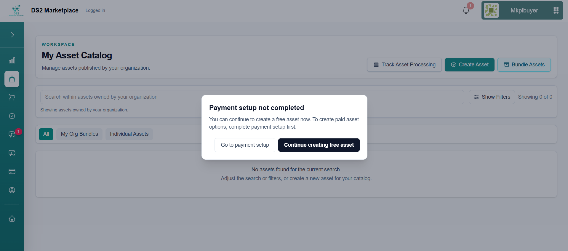
- If you haven't set up payments yet, you'll see a notice that payment setup isn't complete. You can choose Continue creating free asset to publish a free (freemium) listing now, and unlock paid pricing later once you've set up payments.
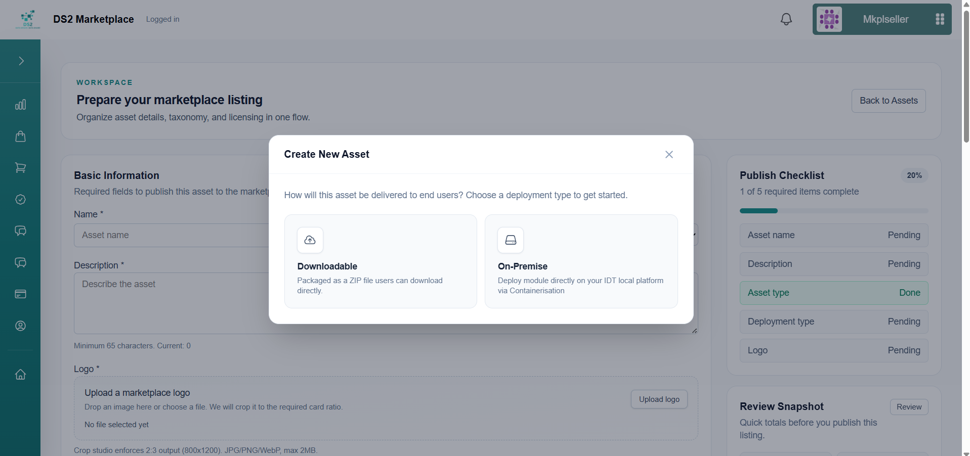
- Choose how the asset will be delivered to buyers — this decision shapes the rest of the form:
- On-Premise — You provide a Helm chart and container images, which buyers deploy via their local Containerisation module.
- Downloadable — You provide a ZIP file that buyers download directly.
1.3a Creating an On-Premise asset
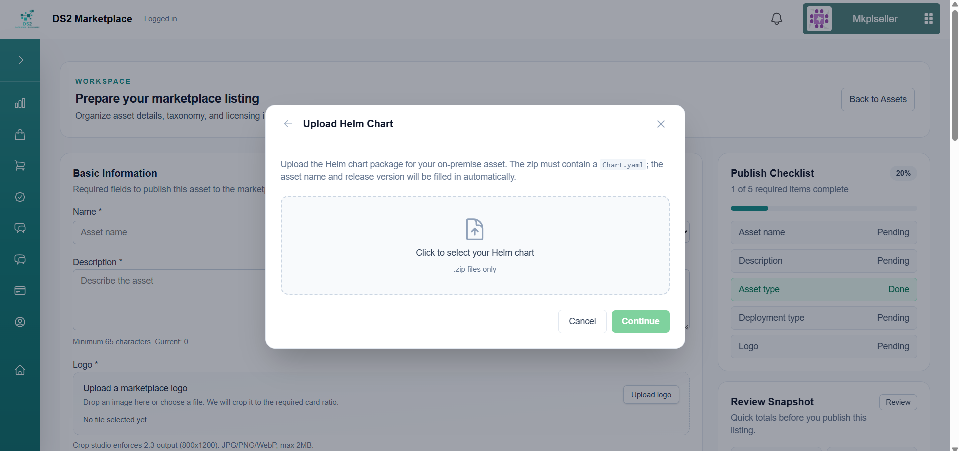
- Upload your Helm chart as a
.zipfile containing aChart.yaml. The asset name and release version are read automatically from the chart, so you don't need to type them.
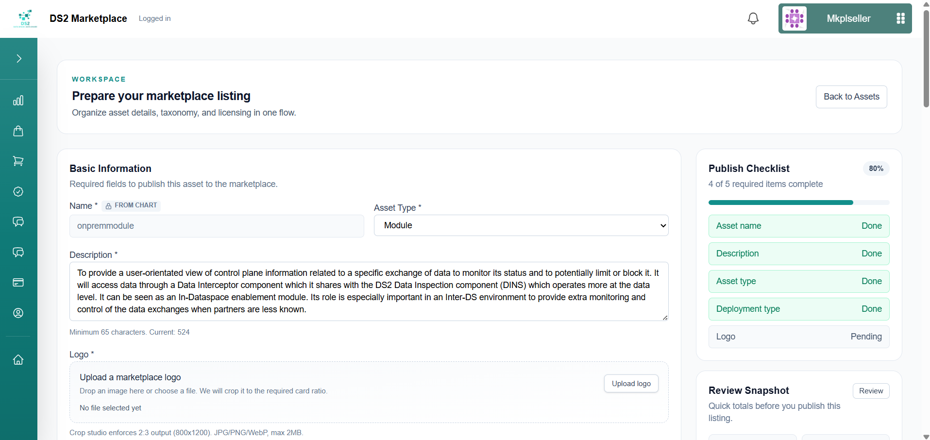
- Basic Information — the name is pre-filled from the chart; set the asset type (e.g. "Module") and write a clear description of what the asset does.
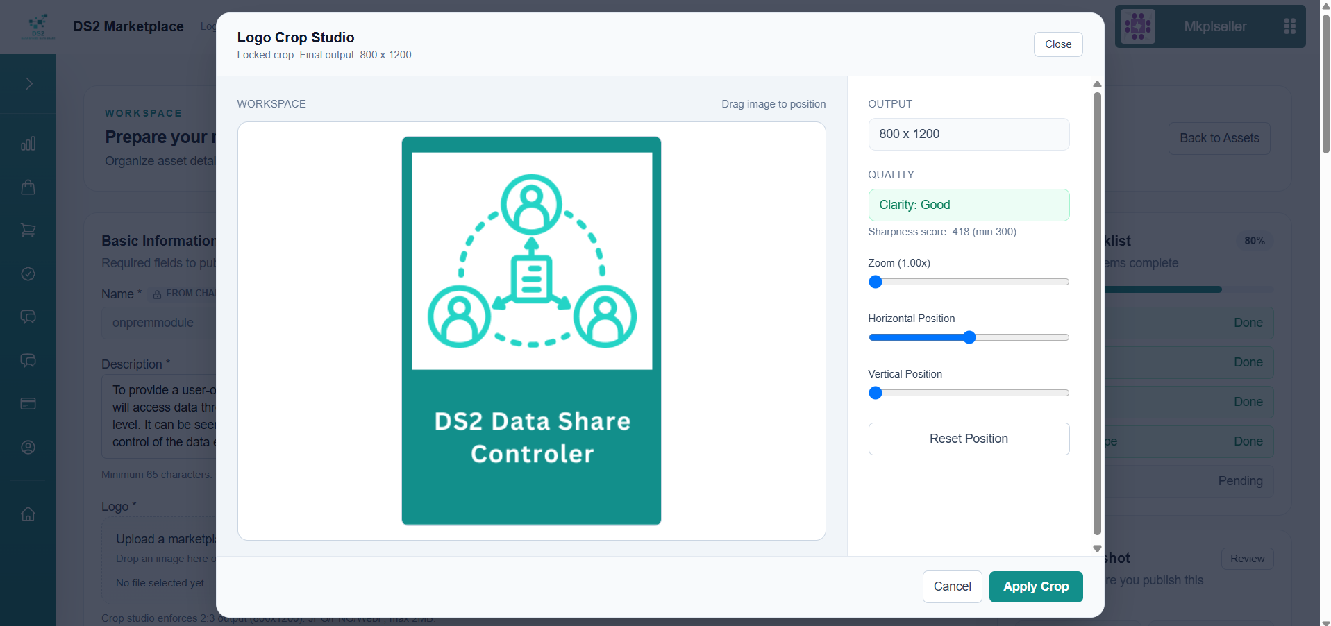
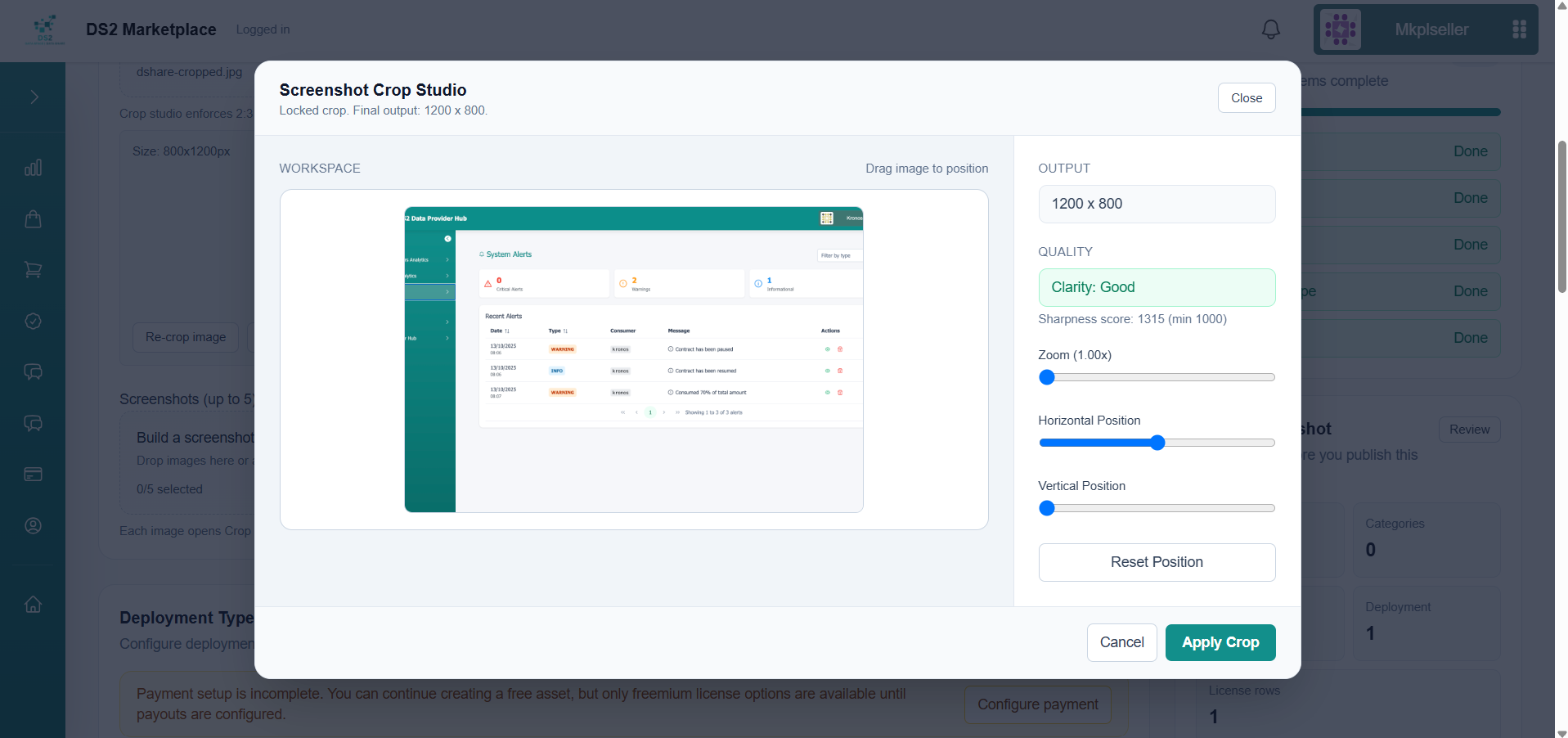
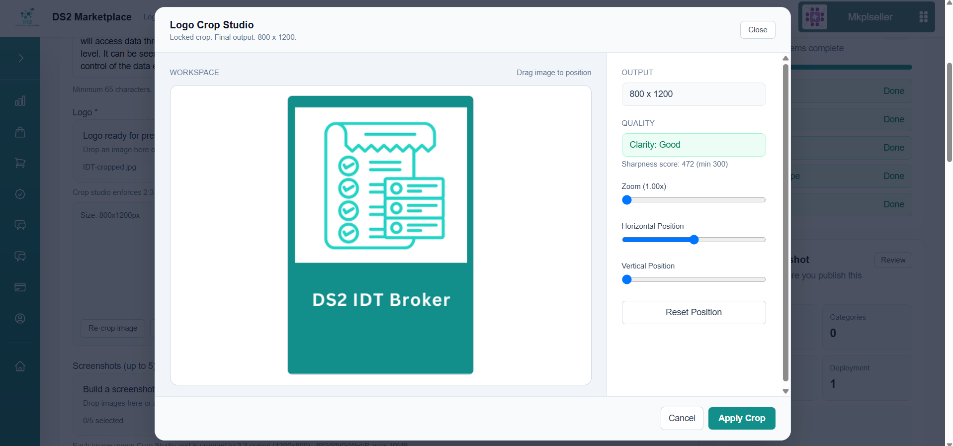
- Add the required logo. The built-in crop tool enforces a fixed size (800×1200) and checks image sharpness so it displays well in the catalog.
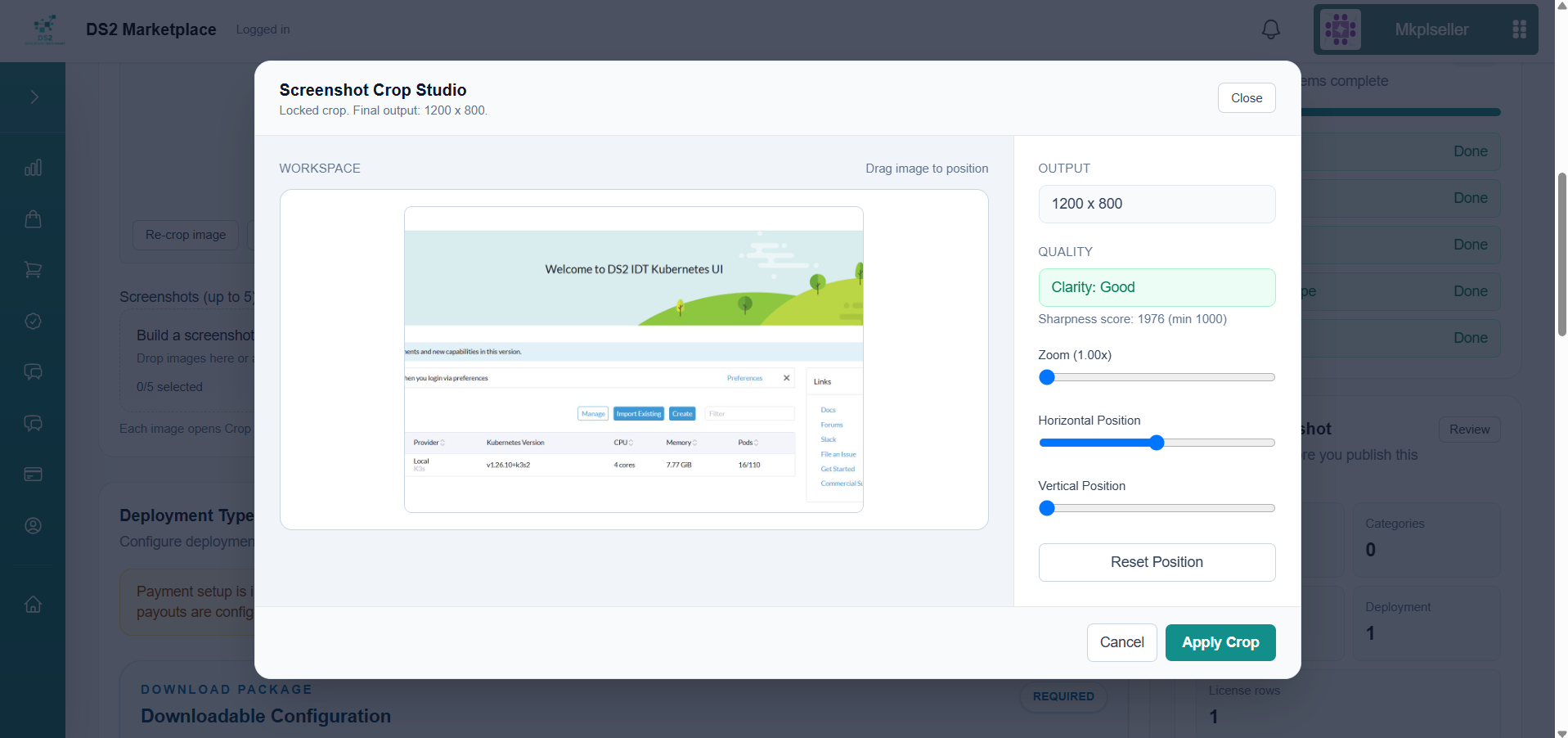
- Add one or more screenshots using the same crop tool, at a fixed size of 1200×800, so buyers get a real preview of the asset.
- Under Deployment, you'll see the container image(s) referenced by the chart you uploaded — a chart can reference more than one image. For each one, upload its corresponding GHCR image as a
.tarfile; these are the actual runtimes the buyer's environment will pull.
Tip: You can create the
.tarfile for an image withdocker save -o image.tar <image>:<tag>.
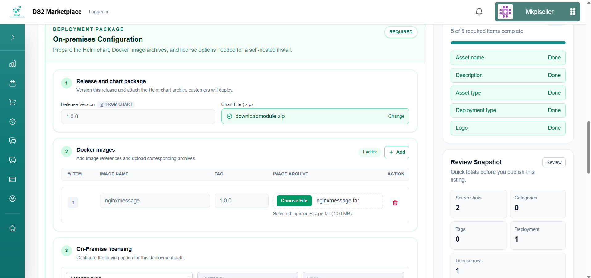
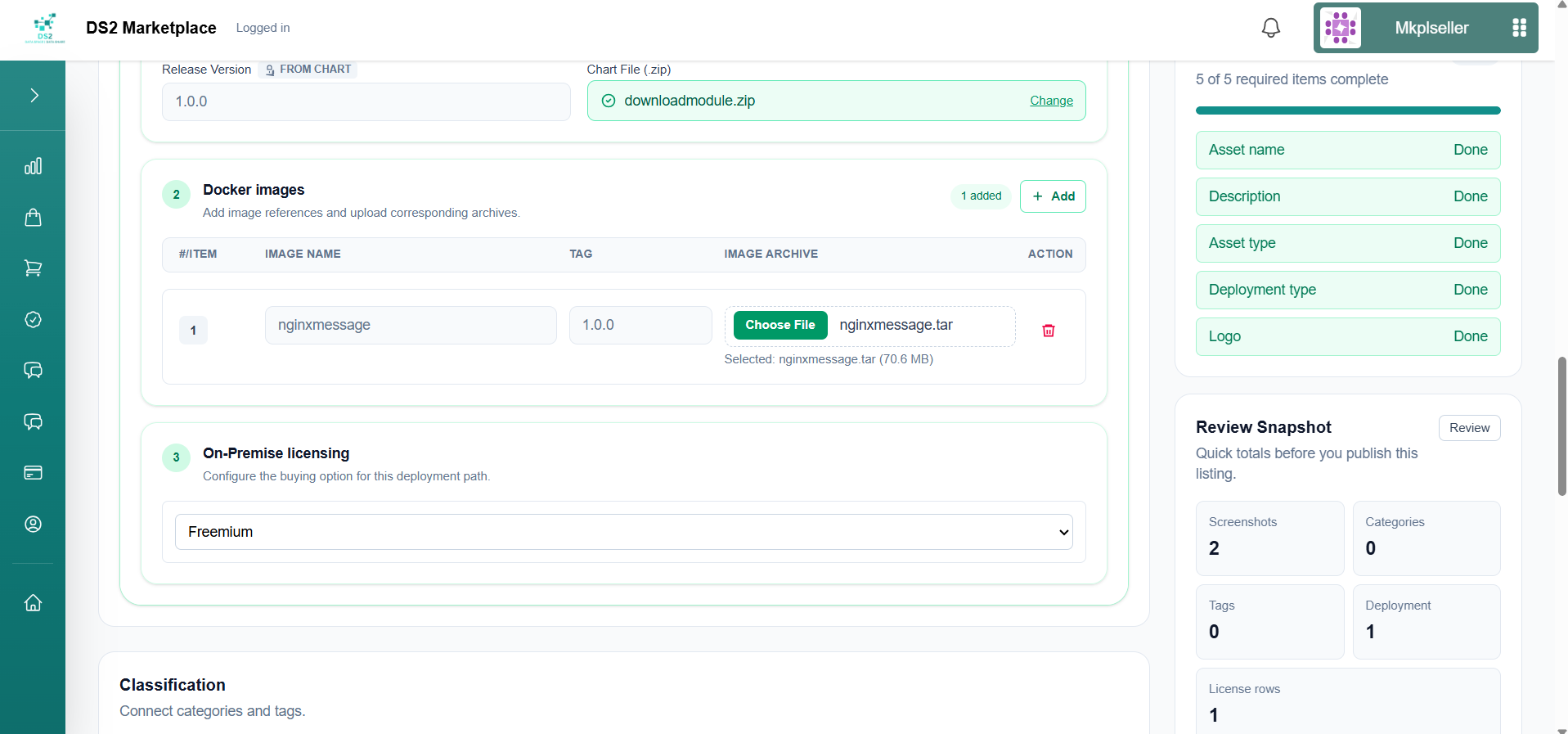
- Once the name, description, type, deployment, and logo are all filled in, the Publish Checklist turns green (5 of 5 complete). Set the licensing model — e.g. Freemium to offer the asset at no cost.
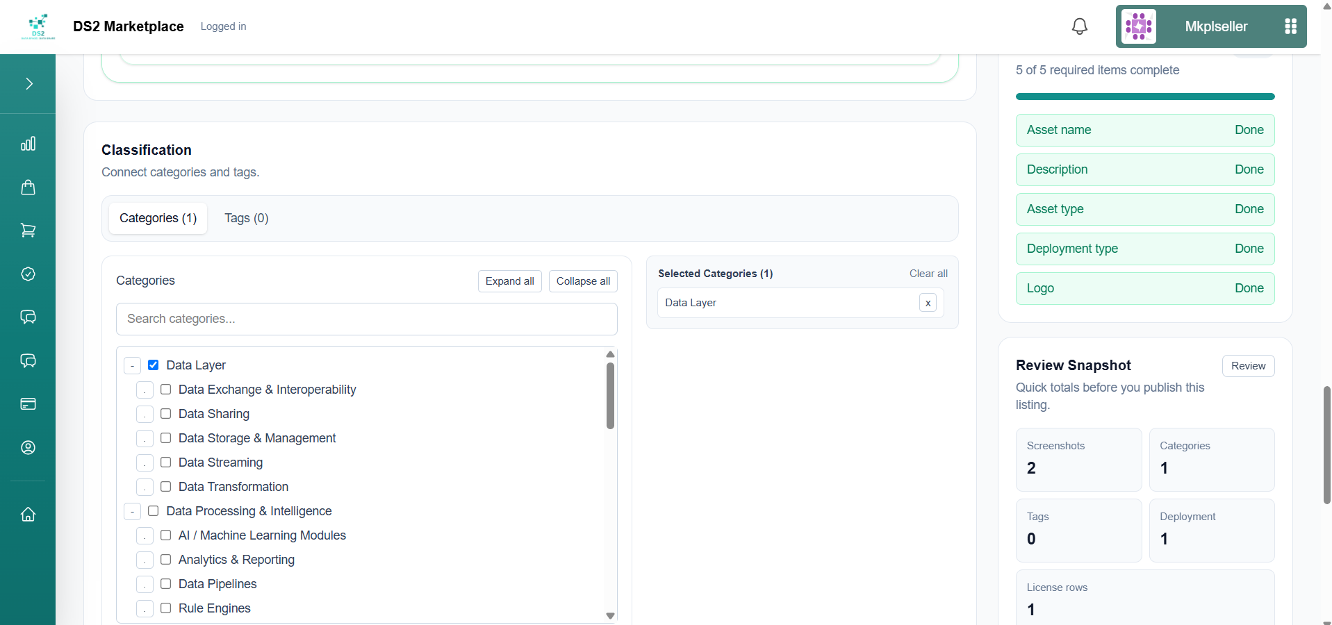
- Classification — add a tag and choose a category (e.g. "Data Layer") to make the asset easier to find in search and filters.
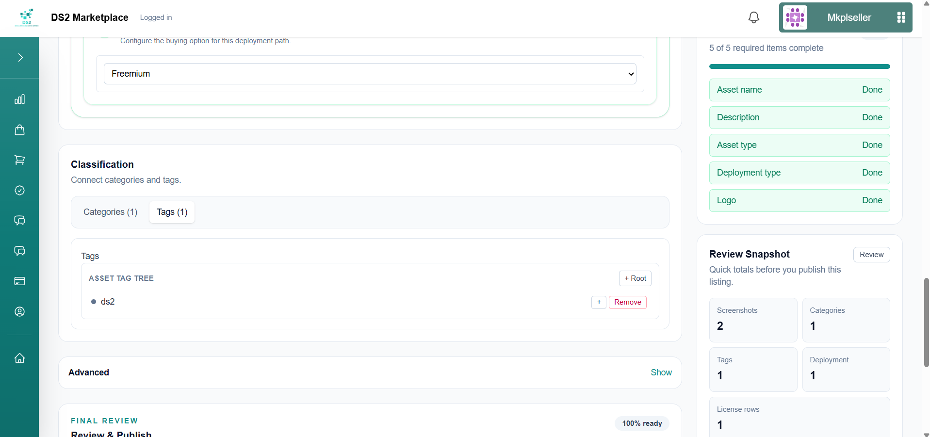
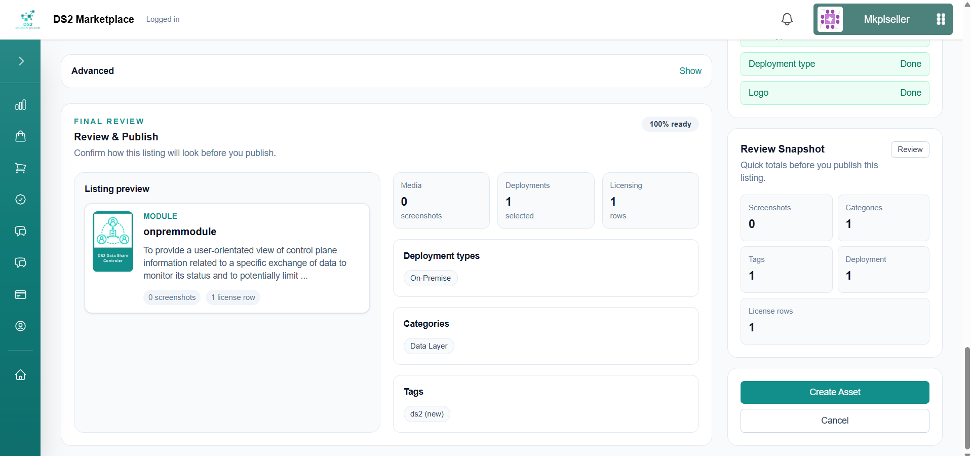
- Review & Publish — the summary panel confirms everything is 100% ready (media, deployment, and licensing all match what you configured). Click Create Asset to publish.
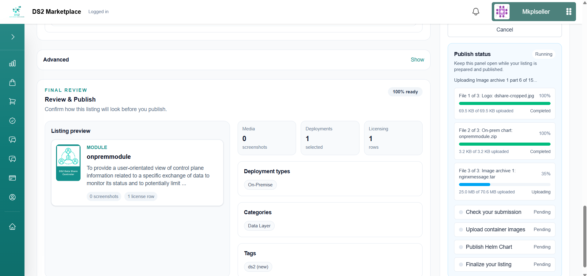
- Publishing uploads your files (logo, screenshots, Helm chart, and container image) with a live progress bar for each. Larger files such as container images can take noticeably longer.
-
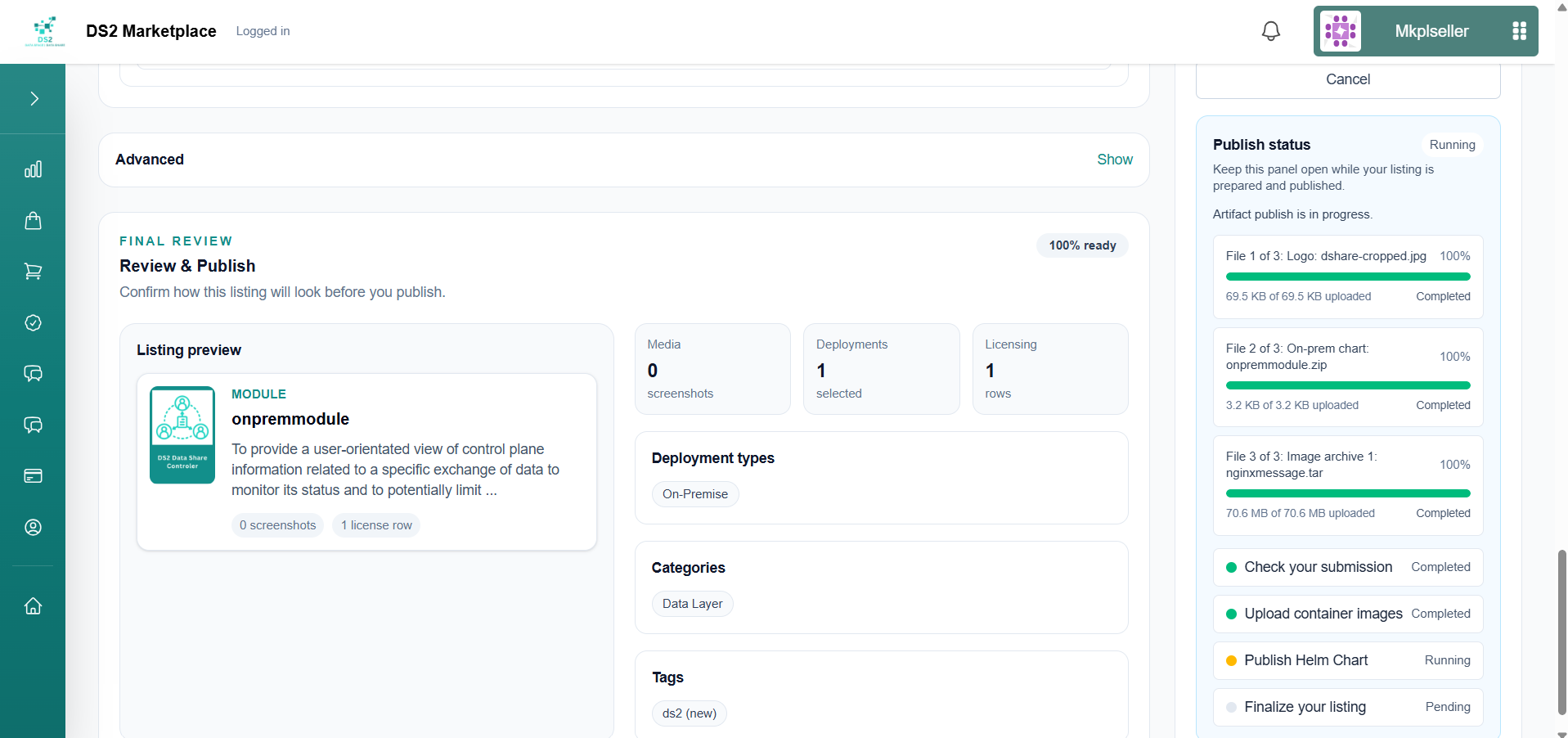
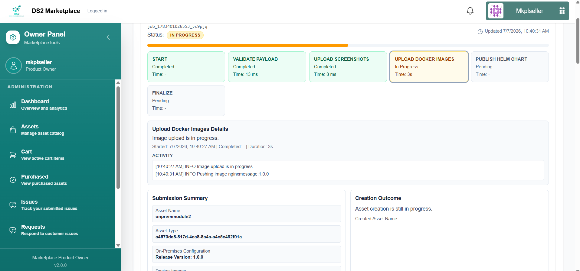
Behind the scenes, the platform runs through processing steps in order: Check your submission → Upload container images → Publish Helm Chart → Finalize your listing. Once every step shows a green checkmark, the asset is fully published.
-
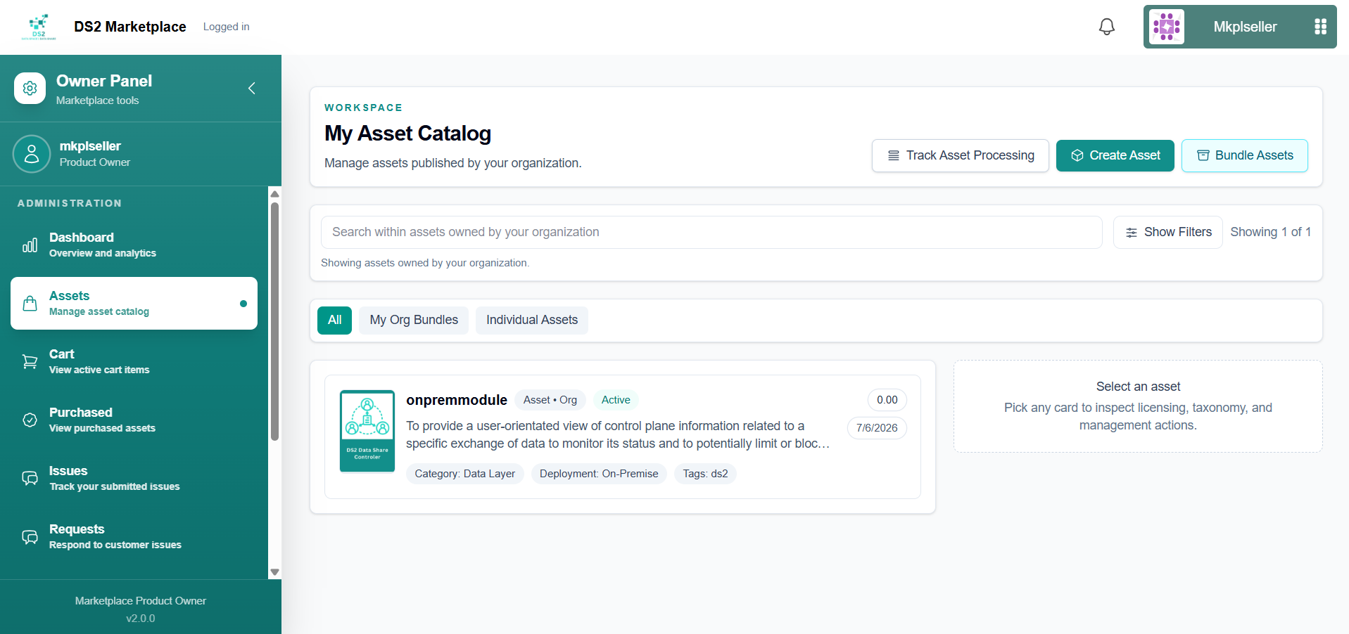
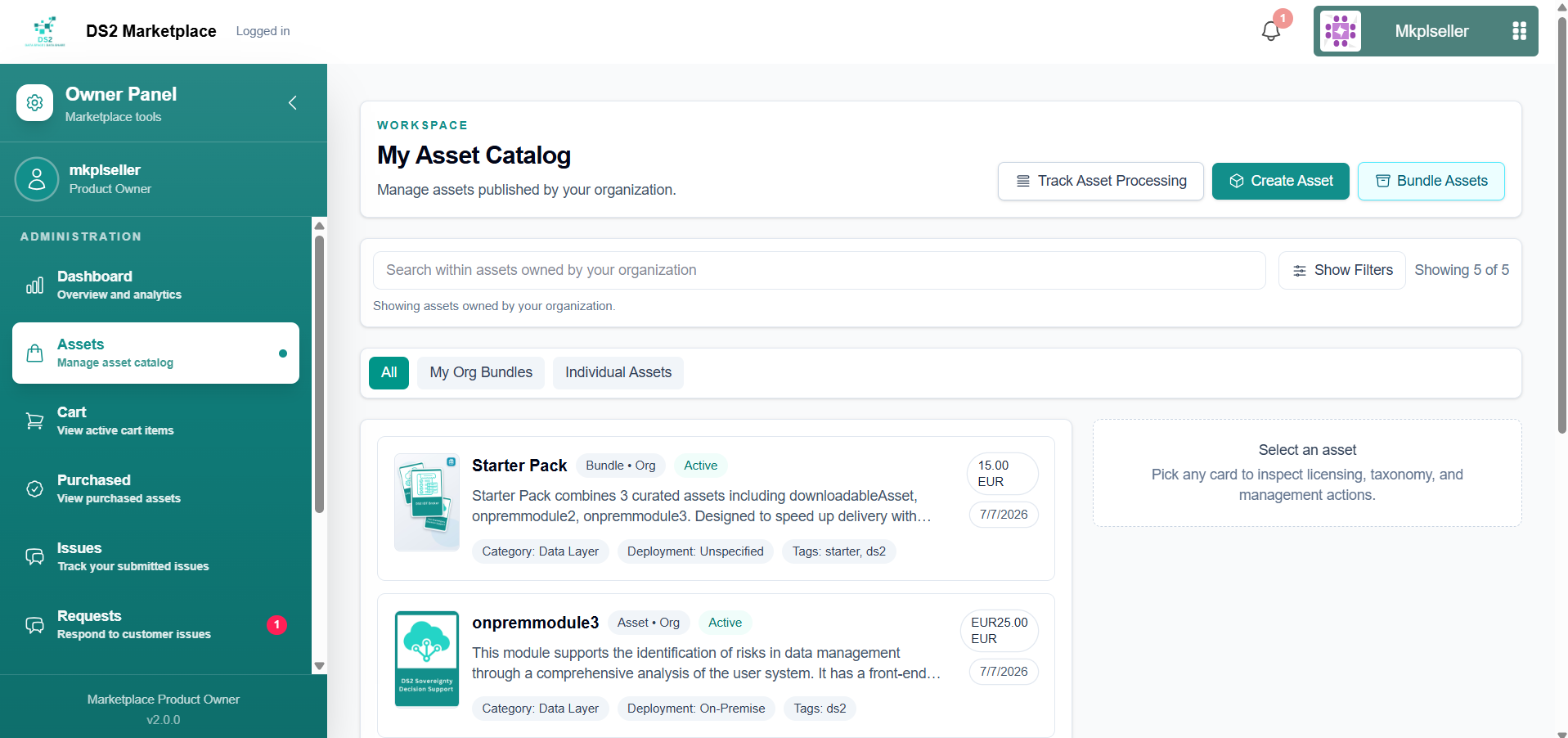
Your new asset now appears in My Asset Catalog as Active, showing its category and deployment type (On-Premise).
1.3b Creating a Downloadable asset
- Since there's no chart to read the name from, type the asset name yourself and set the asset type (e.g. "Module").
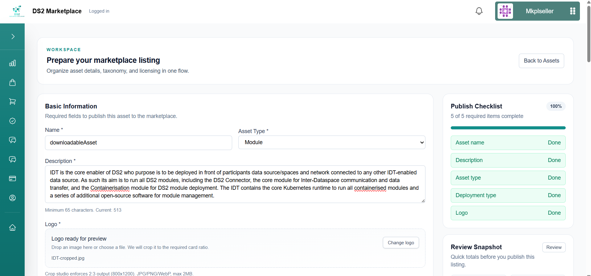
- Write a description, then add the required logo (800×1200 crop) and one or more screenshots (1200×800 crop), using the same crop tool as the on-premise flow.
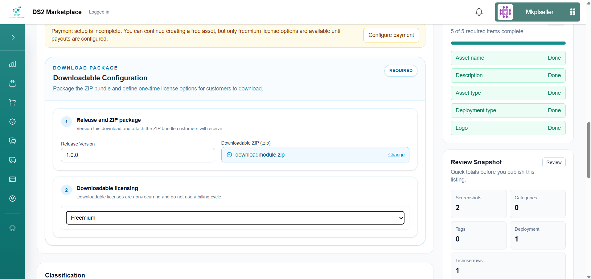
- If payment setup isn't finished yet, you'll see a reminder that only freemium pricing is available for now. Below that, fill in the Downloadable Configuration section: set the release version, attach the ZIP file buyers will receive, and select the license type (e.g. Freemium) to offer it under.
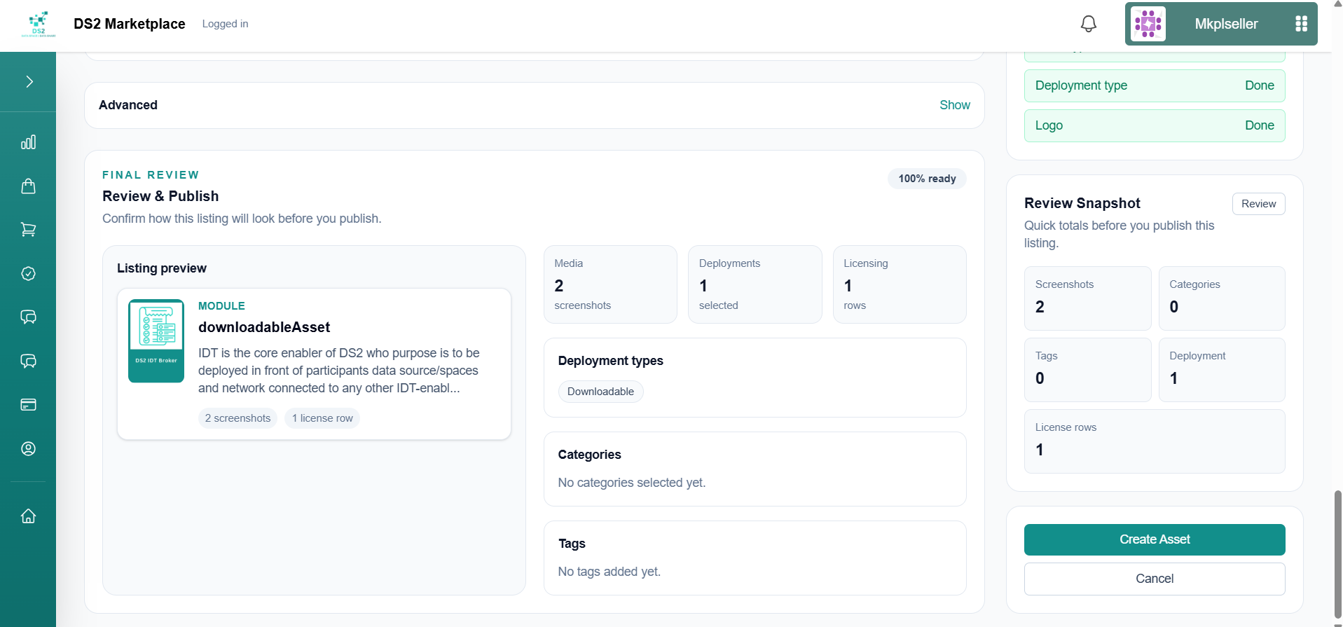
- Review & Publish — once the summary shows 100% ready (tag, category, and deployment type all confirmed), click Create Asset.
- Publishing uploads the logo, screenshots, and ZIP package (delivered via reliable large-file storage), then runs through Check your submission and Publish downloadable artifact.
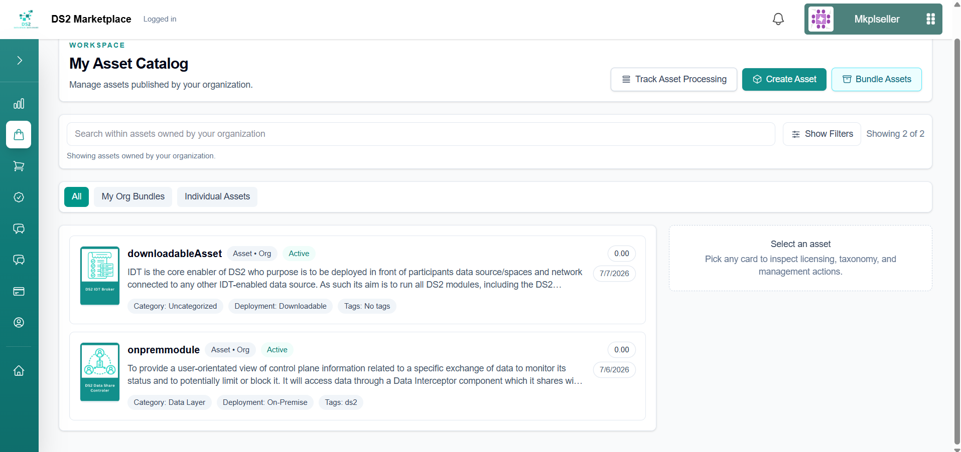
- Your asset now appears in My Asset Catalog as Active, alongside any other assets you've published (e.g. on-premise and downloadable side by side).
1.3c Adding related module suggestions (optional)
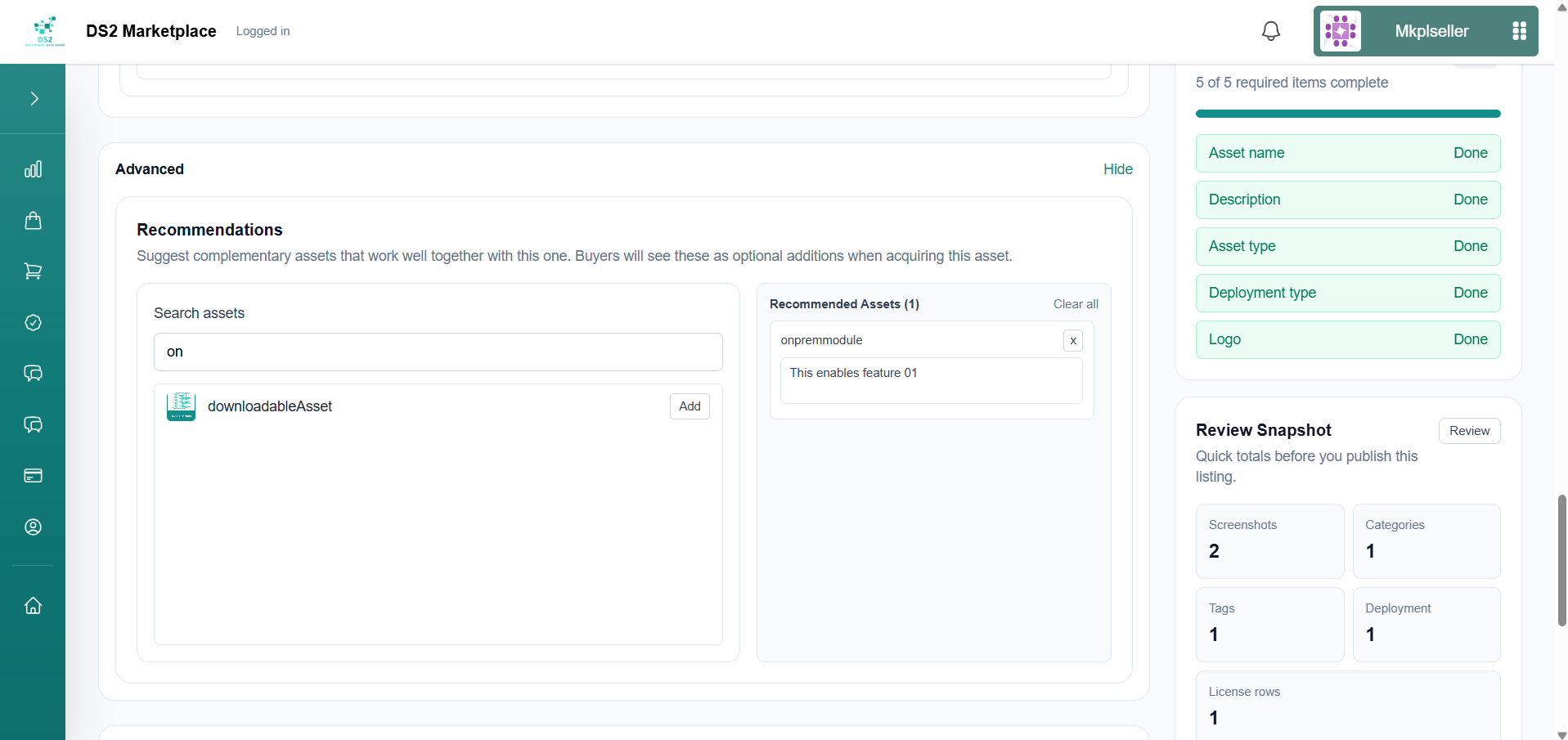
Before publishing, either flow also lets you search for and attach other assets as related suggestions, with a short note on why they're related. Buyers will see these as "Related Modules" on the asset page.
1.4 Tracking publish status
Go to Assets → Pipeline Jobs to see the progress of any asset as it's published, with the same stage-by-stage status (in progress, completed, or failed) shown during publishing.
1.5 Managing existing assets and bundles
- Assets — edit, enable/disable, delete, or view different versions of your assets.
- Bundles — group multiple assets into a single package that buyers purchase together.
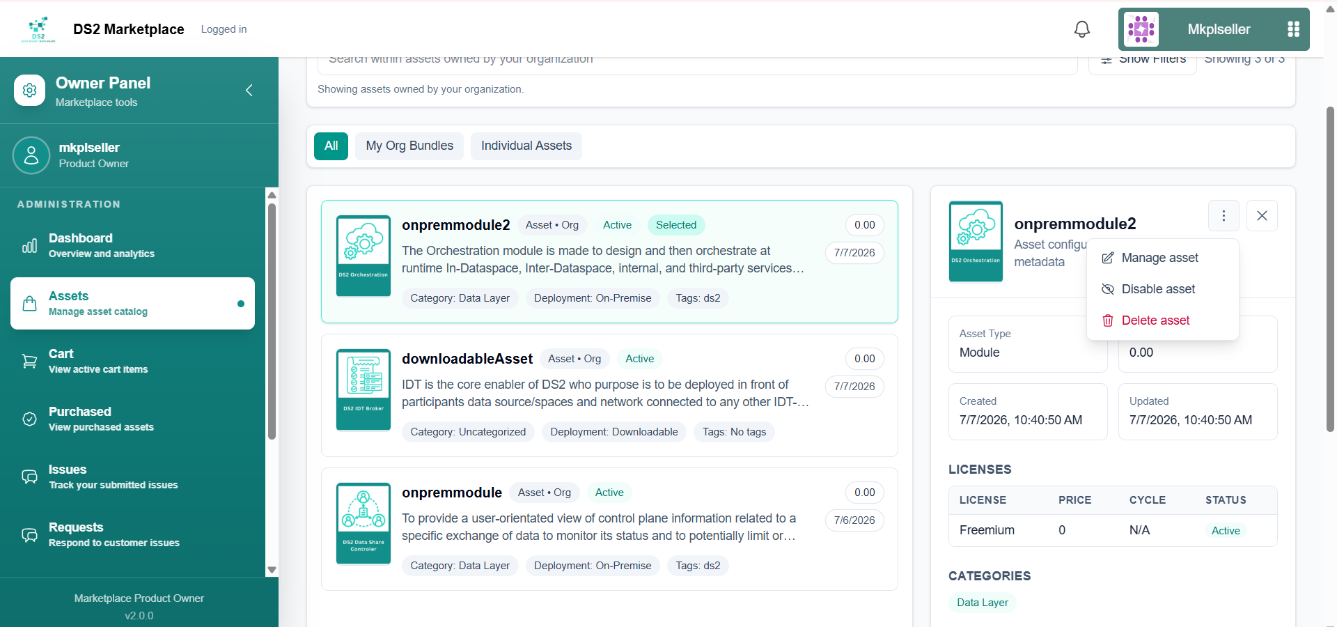
1.5a Creating a new version of an asset
When you need to release an update to an asset you've already published — for example, a new container image or an updated Helm chart — you create a new version rather than editing the original listing directly. Older versions are never deleted automatically: you always stay in control of which release is "current" and "live".
- From My Asset Catalog, open the asset you want to update, then go to its Versions page.
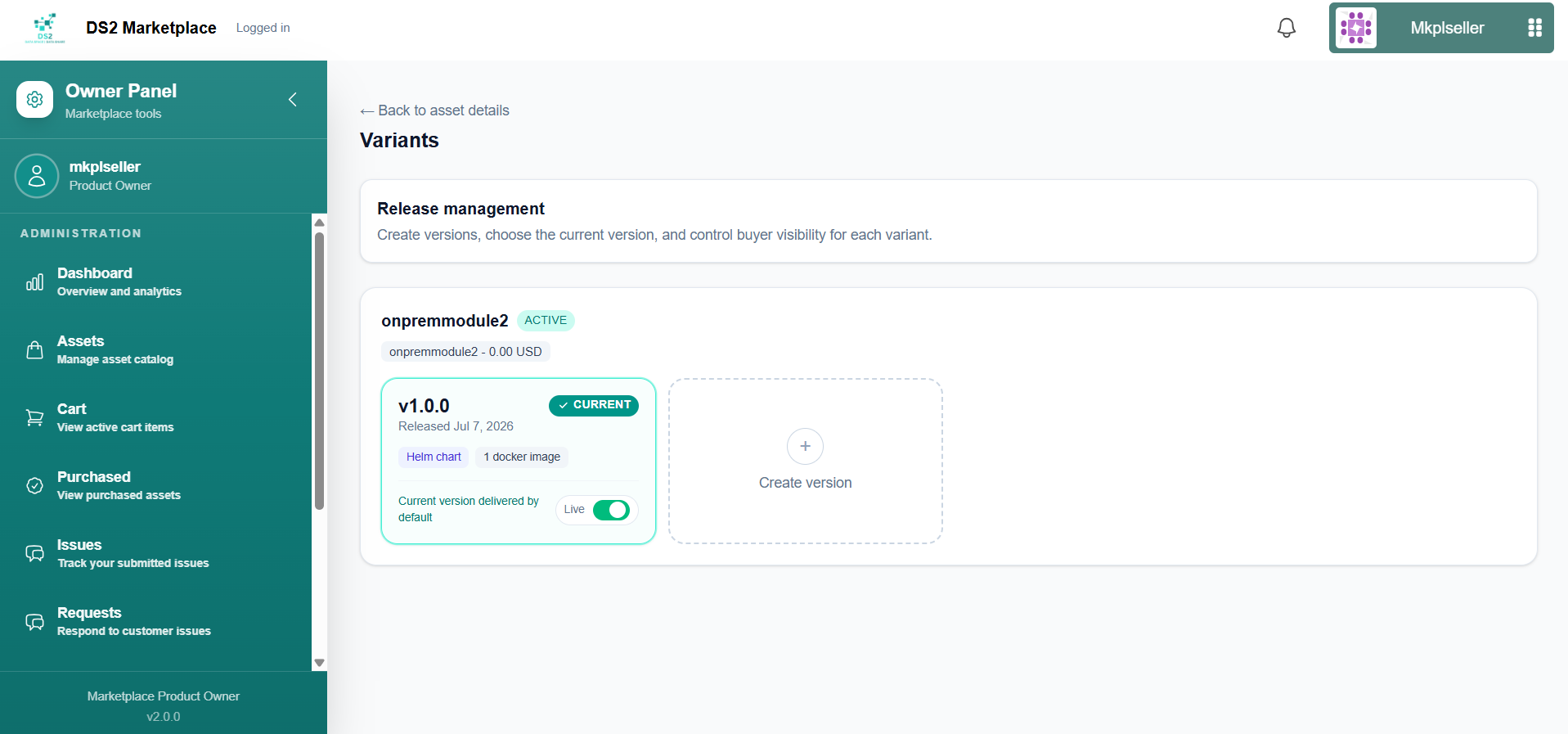
- Click Create version. Any container images already linked to the asset (from the previous version) are carried over automatically, so you don't need to re-attach files that haven't changed.
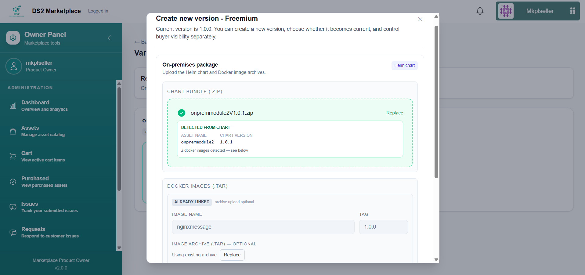
- To add a new or updated container image, give it a name and a version tag (e.g.
1.0.0), then attach its image archive file. A single version can ship more than one container image if needed.
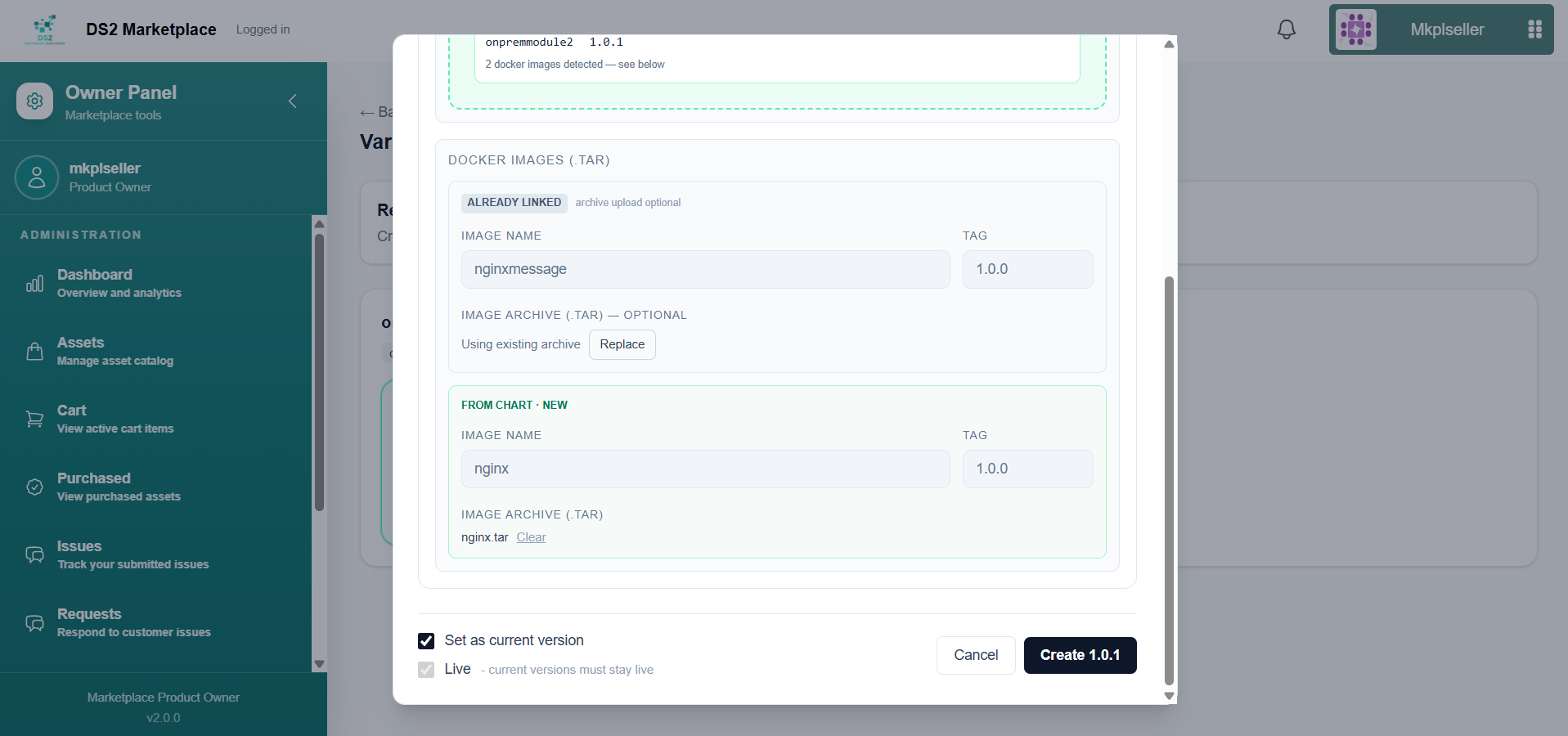
-
If you're also updating the underlying package (e.g. a new Helm chart), attach the updated chart file for this version as well.
-
Decide how this version should behave once created:
- Check Set as current version if buyers who already own this asset should be offered this release as their next update.
- Check Live if the version should be visible/available immediately once published.
Leaving either box unchecked lets you prepare a version in advance without exposing it to buyers yet.
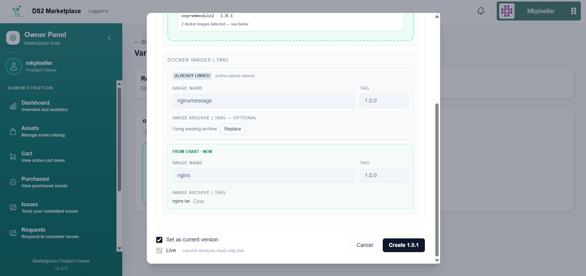
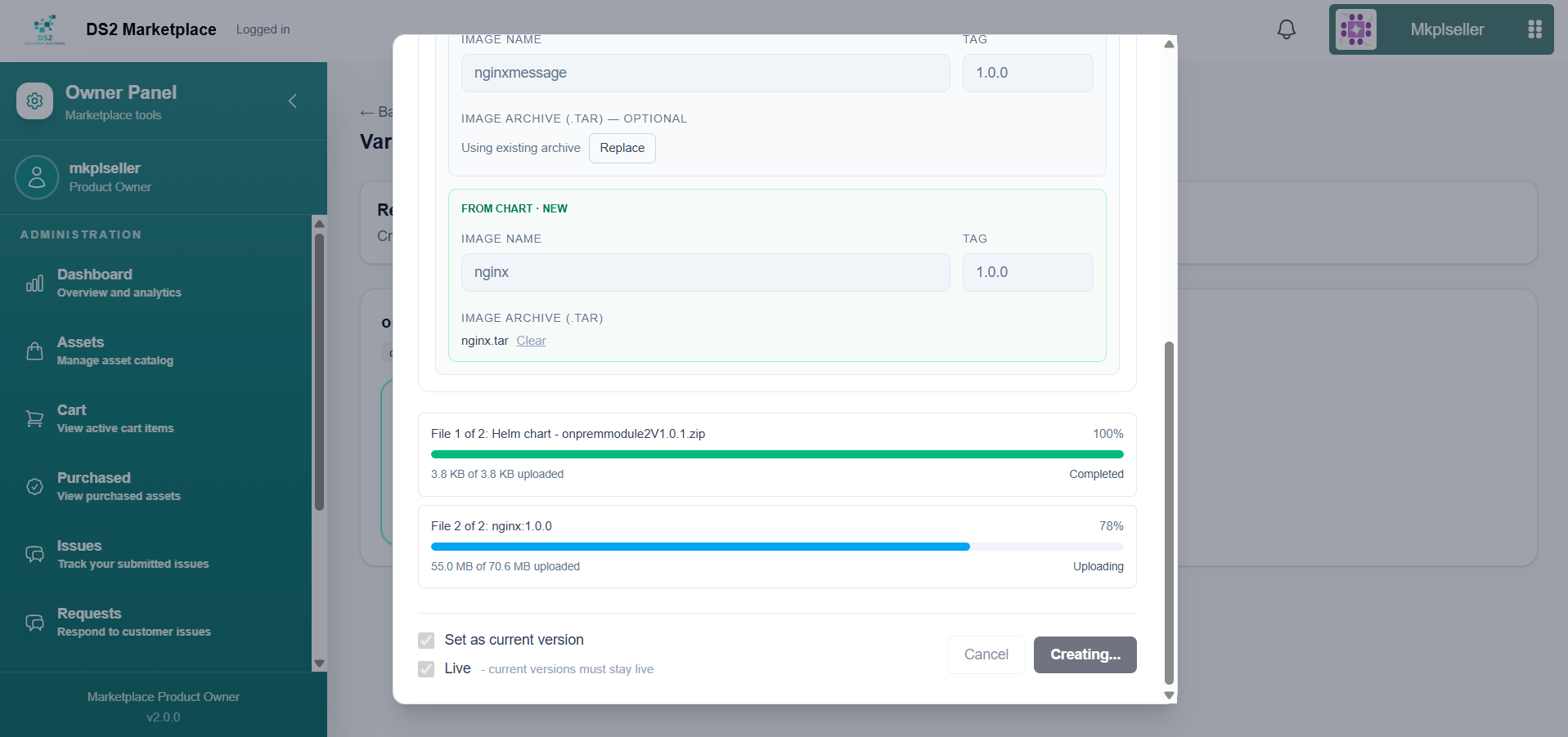
- Click Create [version number] (e.g. Create 1.0.1) to start the upload. Progress is tracked file by file — the updated package and any large container images may take noticeably longer than smaller files.
- Once the upload finishes, a "New version created successfully" confirmation appears, and the Variants page lists the new version as CURRENT while the previous version is marked NOT CURRENT.
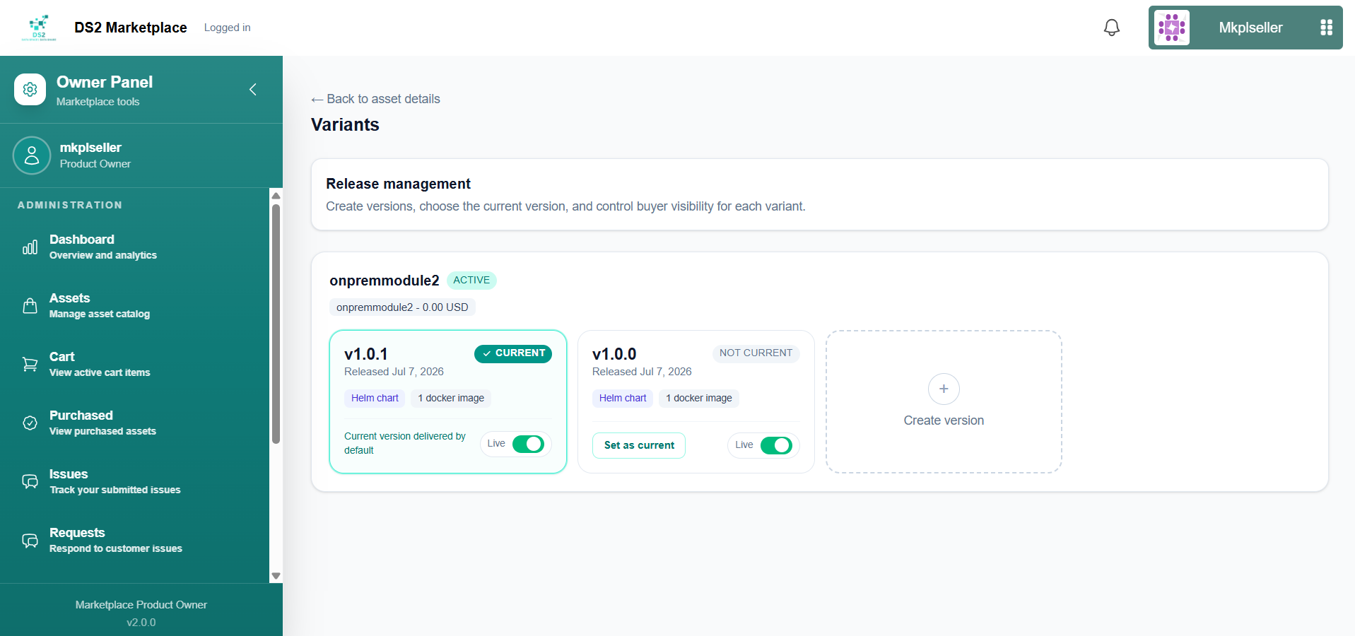
- You can switch back to an older release at any time by opening that version and selecting Set as current — nothing is lost by publishing a new version.
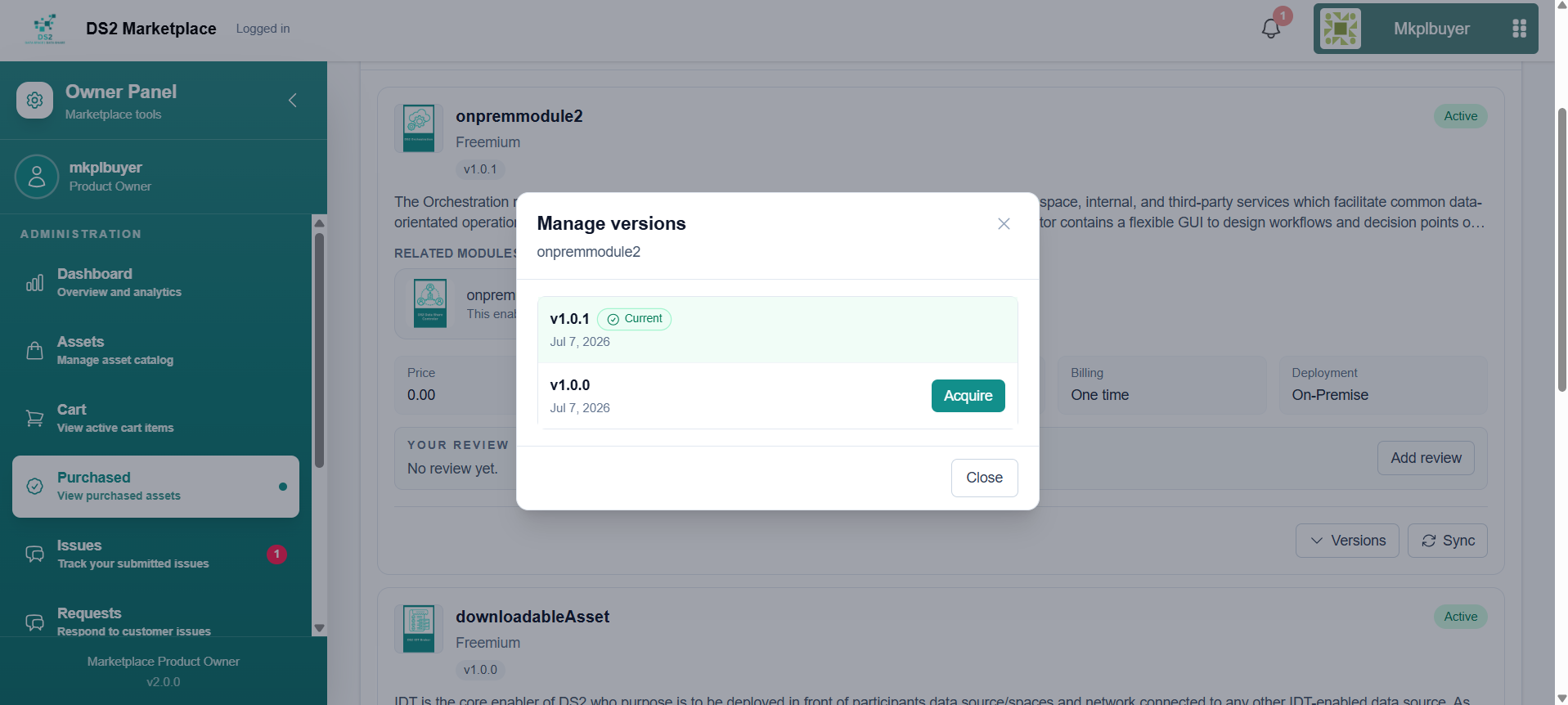
What buyers see: Existing buyers are not force-upgraded. On their Purchased page, a Versions control lets them open a Manage versions dialog listing every release of the asset, with their current installed version marked and any newer version available to acquire whenever they choose to update.
1.5b Bundling assets together
A bundle lets you package several of your own published assets into a single listing that buyers purchase as one unit, usually at a discount versus buying each asset separately.
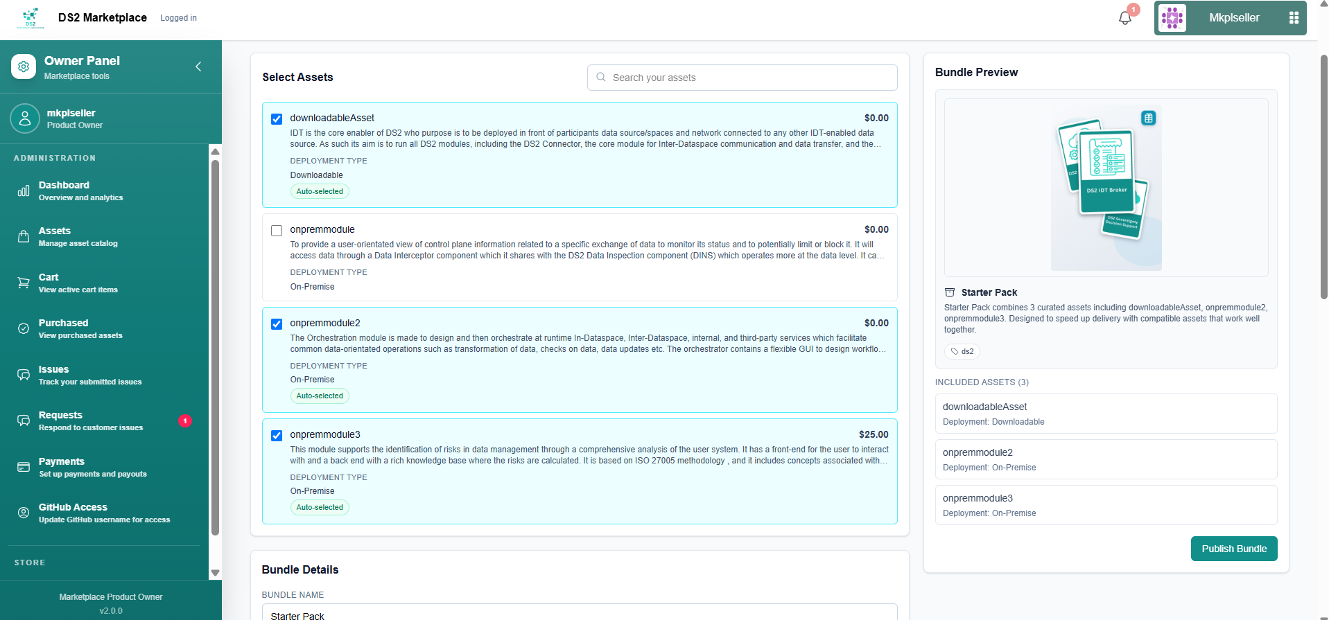
- Go to Assets → Bundles, then click Bundle Assets.
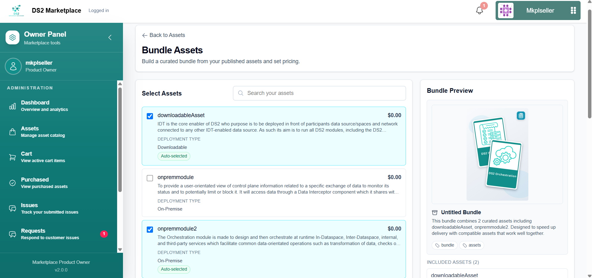
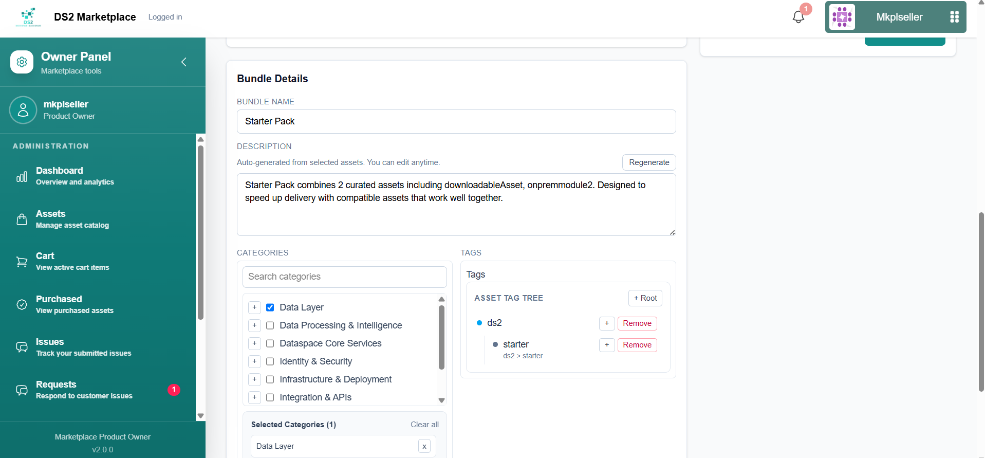
- Enter a Bundle Name (e.g. "Starter Pack"). A Bundle Description and a composite bundle logo (built automatically from your selected assets' logos) are generated for you as soon as you pick assets — you can edit the description freely, or click Regenerate to get a fresh auto-written version. Then set the Classification — categories and tags for the bundle, the same way as for a single asset, so it's easy for buyers to discover.
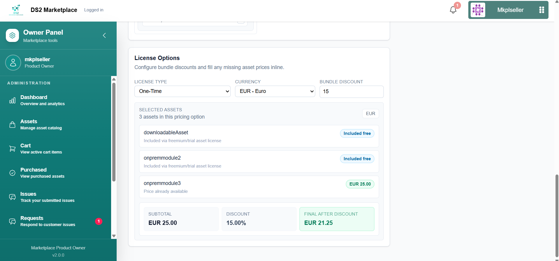
- Configure pricing — set a Bundle Discount (a percentage taken off the combined price of the included assets). The page shows you the discount amount and the Final After Discount price so you can check it before publishing.
If any selected asset is missing a price for a license type/currency you want to use in the bundle, you can fill in that missing price right there on the same page — every included asset needs a price for each license type/currency combination the bundle offers.
- Click Publish Bundle. Once published, the bundle behaves like any other listing — buyers can find and purchase it from the storefront as a single package.
1.6 Setting up payments
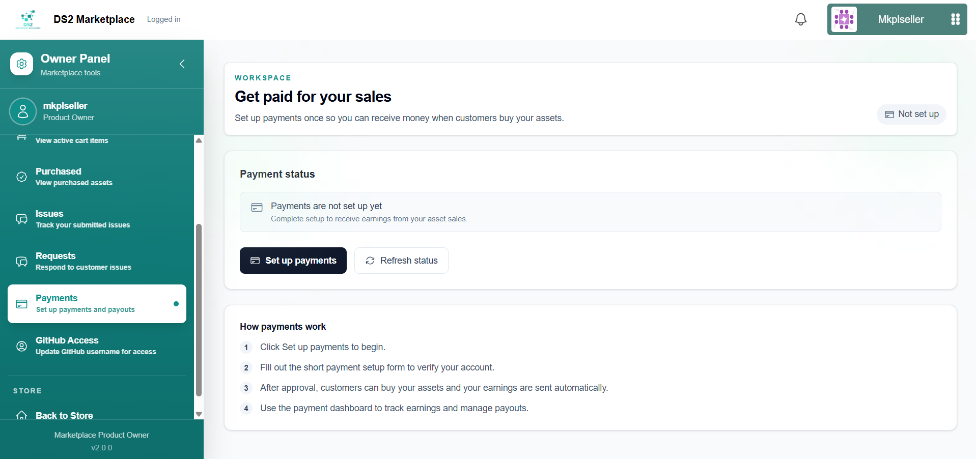
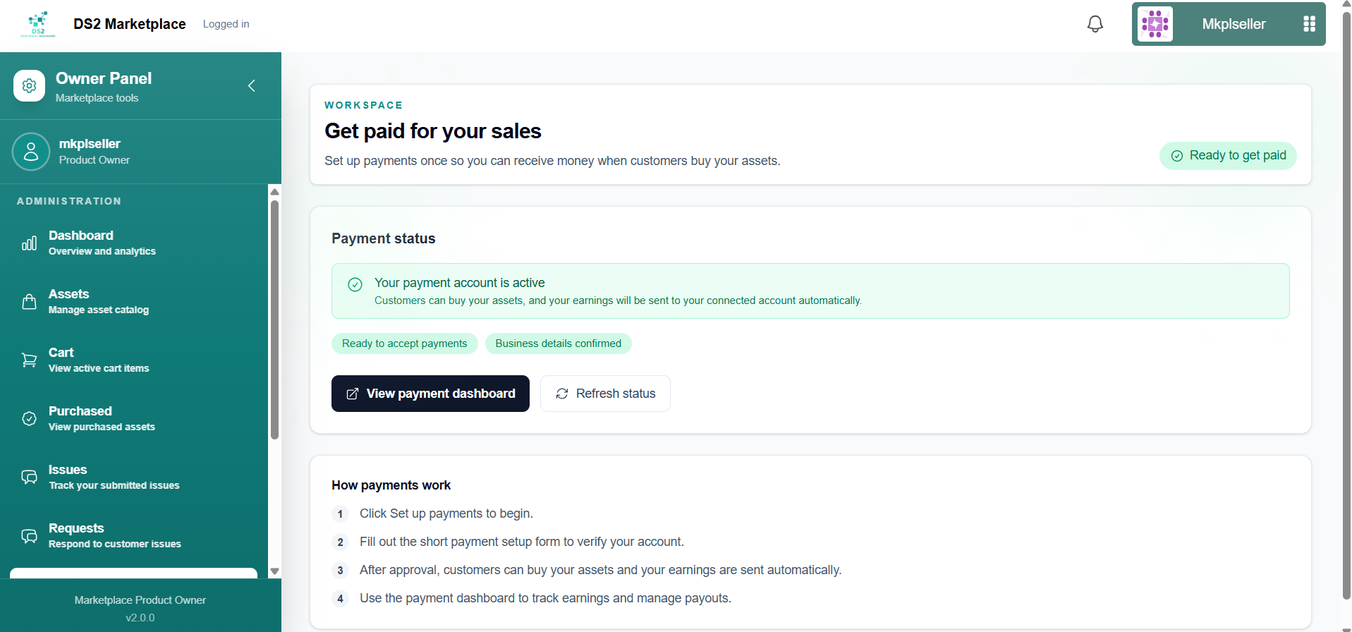
Go to Payments and click Set up payments to start the payment setup process. The status will update from "Not set up" → "Setup in progress" → "Ready to get paid". Use Refresh status if it doesn't update automatically, or View payment dashboard once it's complete.
1.7 Responding to buyer support requests (Dev Connect)
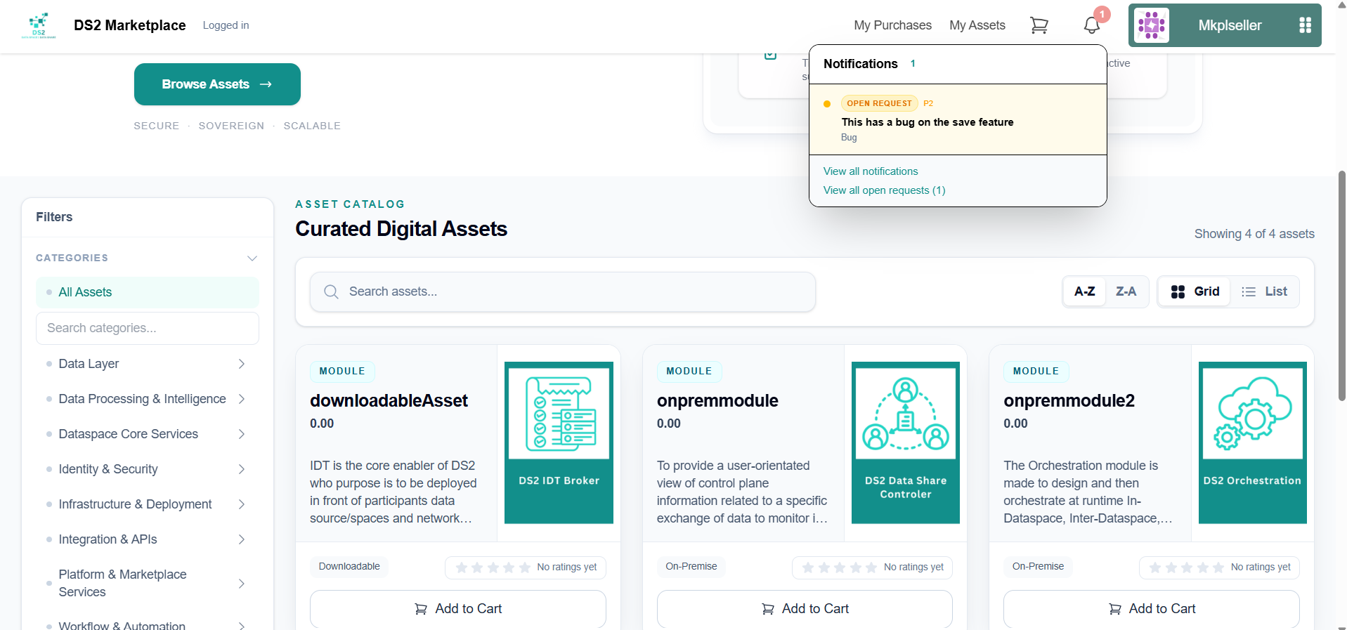
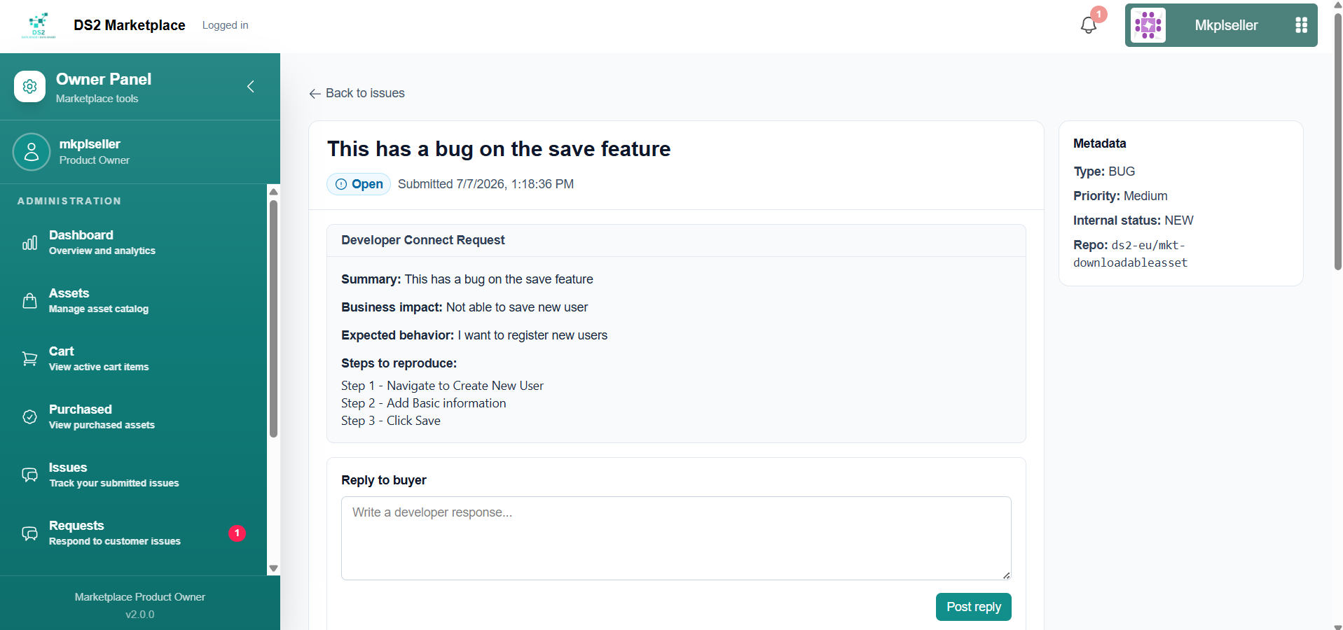
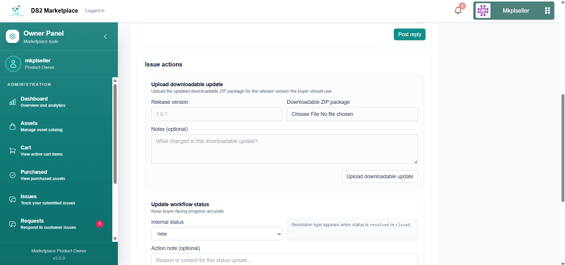
Go to Requests to view and respond to Dev Connect tickets raised by buyers about your assets. New requests also appear under the notification bell icon at the top of the page.
2. Buyer Guide
Buyers can browse the storefront without logging in, but need to log in to make a purchase.
2.1 Browsing and searching
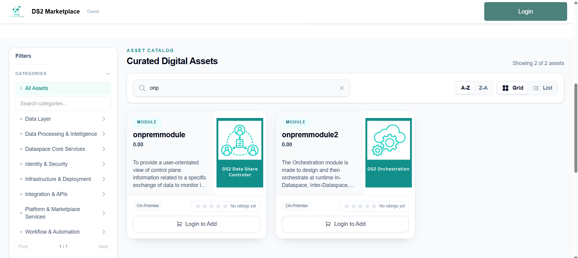
Visit the marketplace homepage to browse the catalog. Use the search bar, sorting options, and grid/list view toggle to find what you need, and narrow results using the filters.
2.2 Viewing an asset
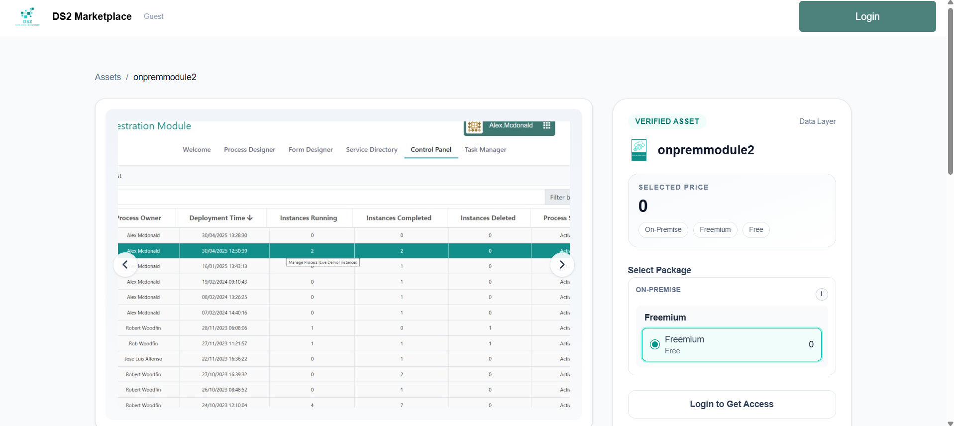
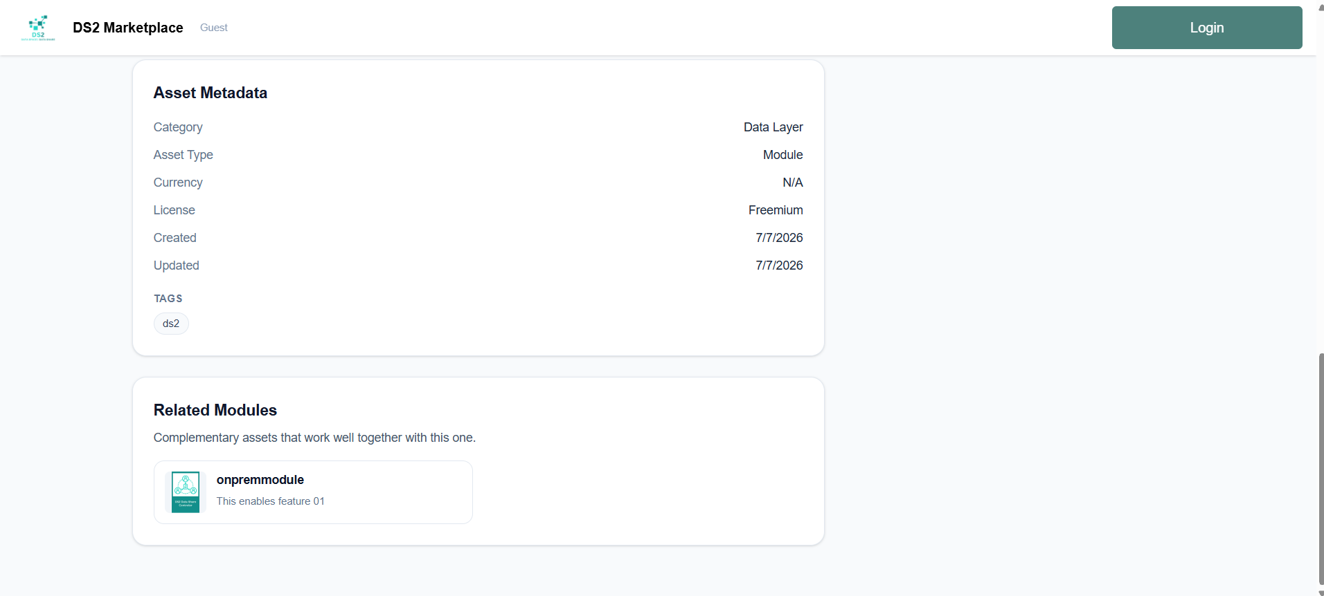
Click any asset to open its detail page, which shows screenshots, a description, category, reviews, and a Related Modules section with similar assets suggested by the seller.
2.3 Choosing an option and buying
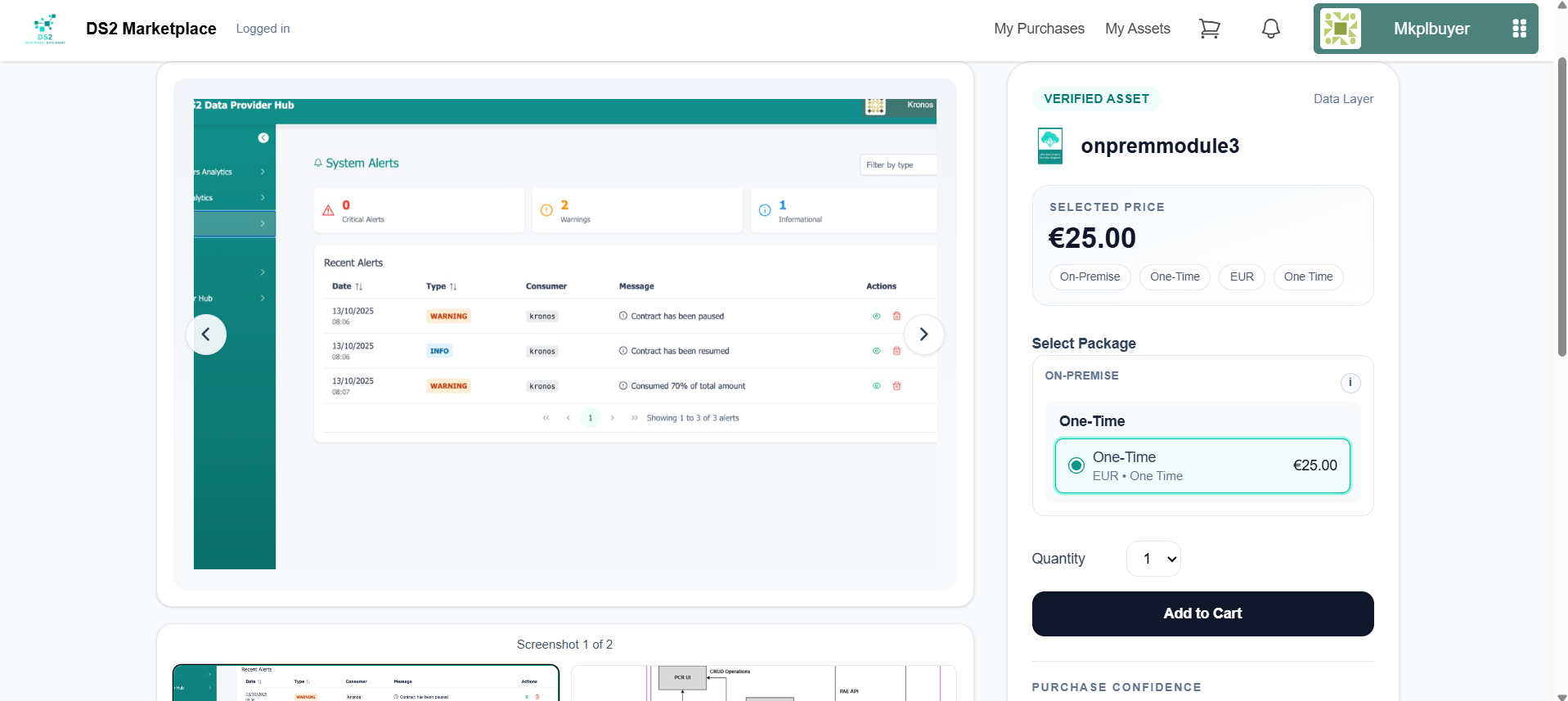
On the asset page, the purchase panel groups the available options (On-Prem / Downloadable) and licenses, each with its price and billing cycle. Pick a quantity and click Add to Cart (or Login to Purchase if you haven't signed in yet).
2.4 Cart and checkout
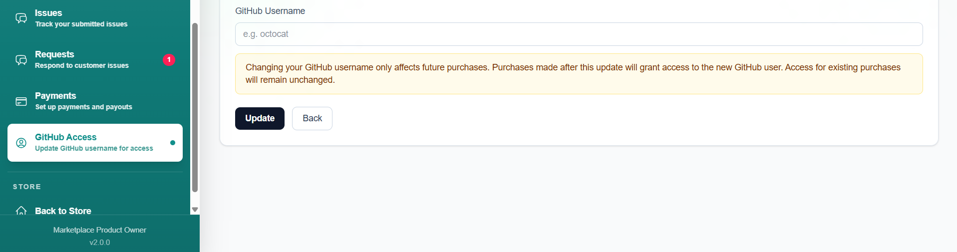
- If you're buying an On-Premise asset, go to GitHub Access first and enter your GitHub username, then click Update. This is required before checkout — access to on-premise assets is granted to this GitHub user, and changing it later only affects future purchases, not ones you've already made.
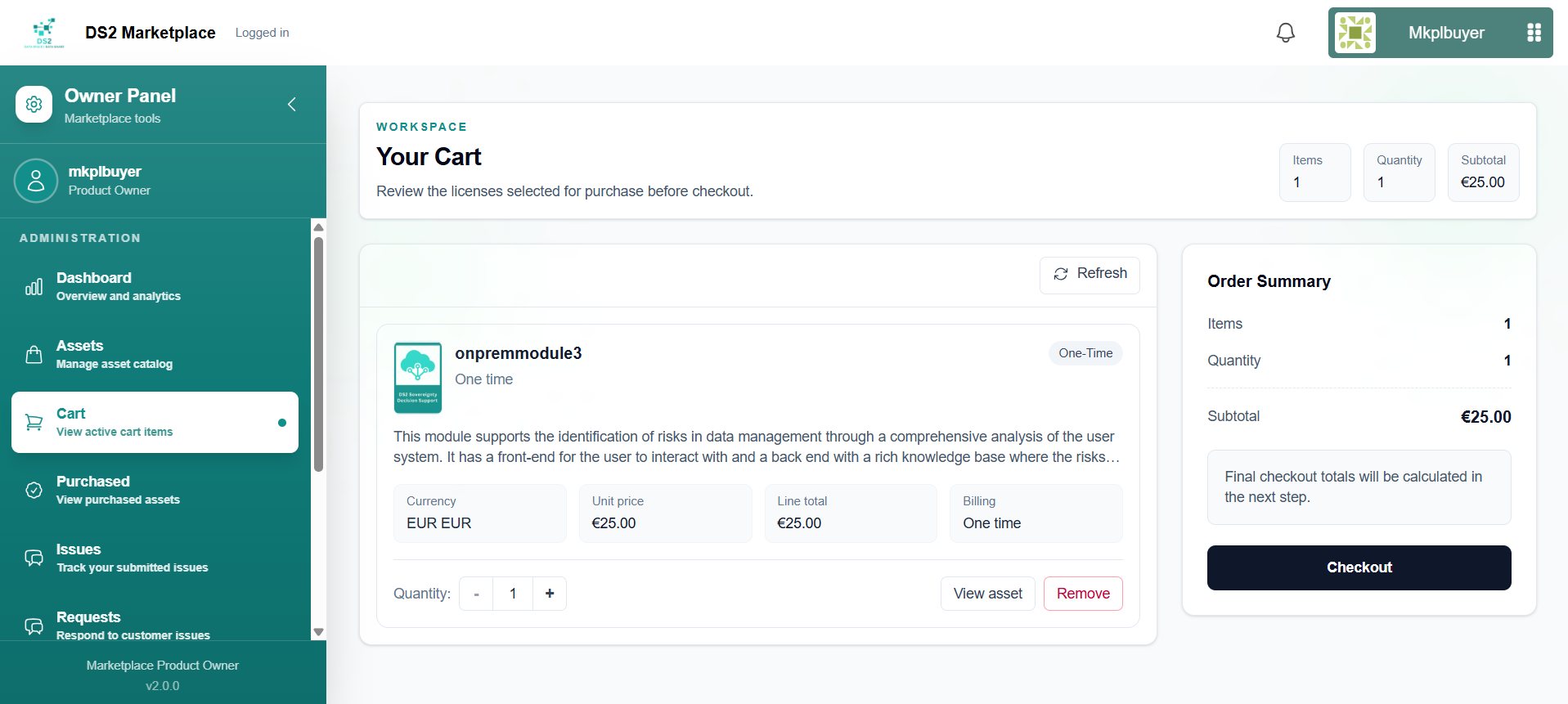
- Go to your Cart to review items.
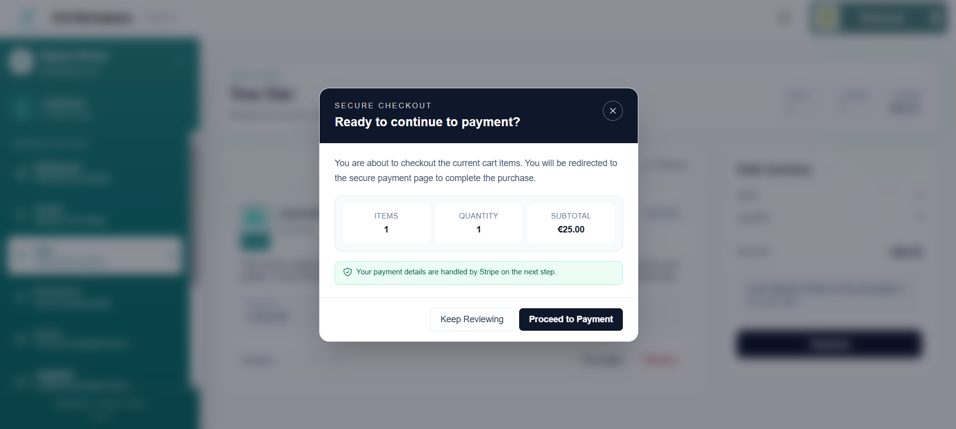
- Click Checkout, then confirm by clicking Proceed to Payment in the pop-up.
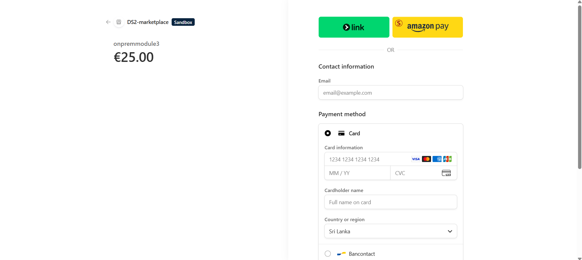
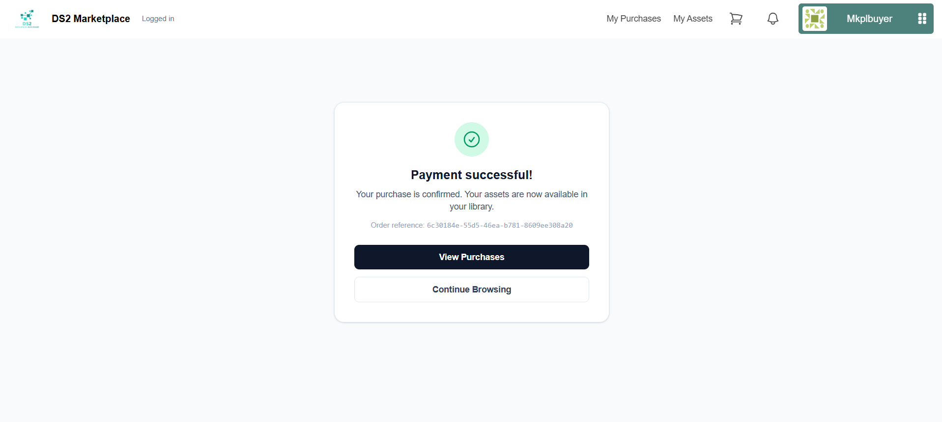
- You'll be taken to a secure payment page to complete your purchase, then brought back to a Payment successful! confirmation page.
2.5 Accessing your purchases
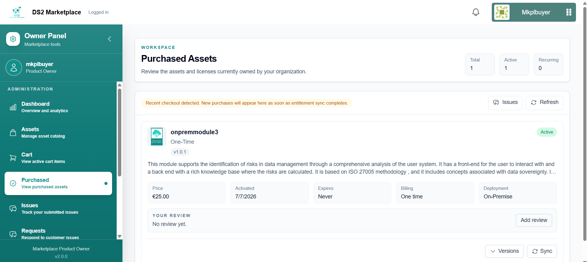
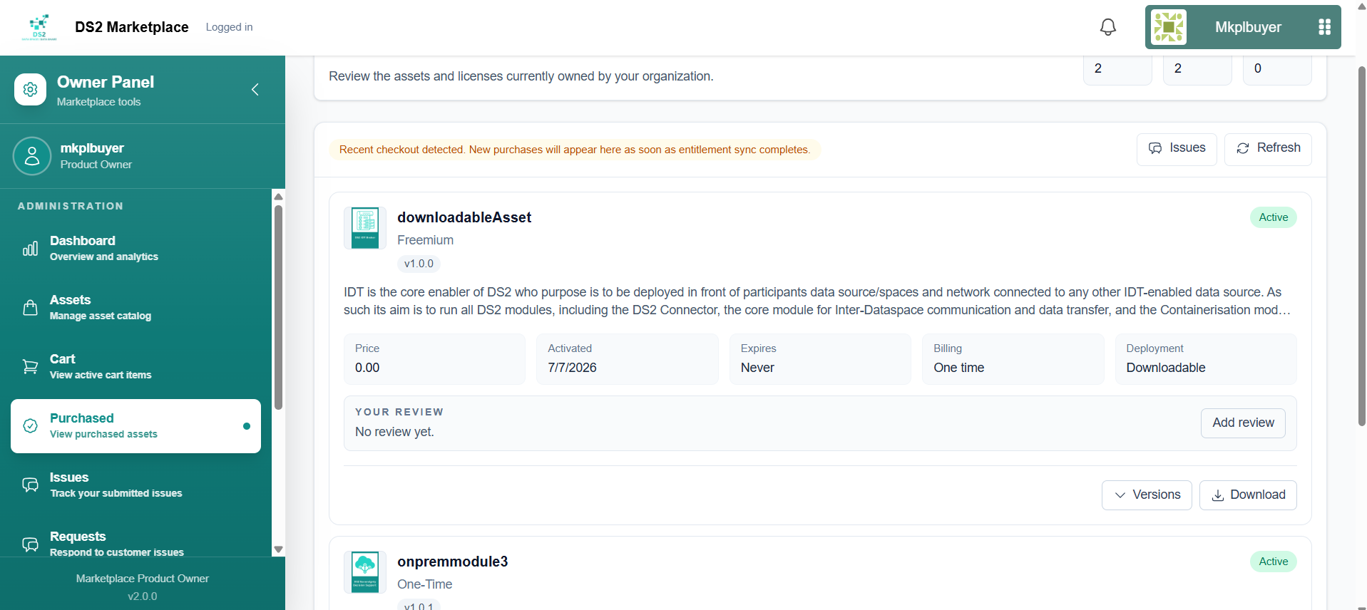
Go to Purchased to see your library of purchased assets: - On-Prem assets are installed via your local Containerisation module, which picks up the purchased module's charts from your organisation's monitored GitHub repository. - Downloadable assets are simpler — just click the Download button. The file downloads directly to your computer as a ZIP, ready to unpack and use.
You can also leave a review for a purchased asset from this page.
2.6 Getting help / raising a support ticket (Dev Connect)
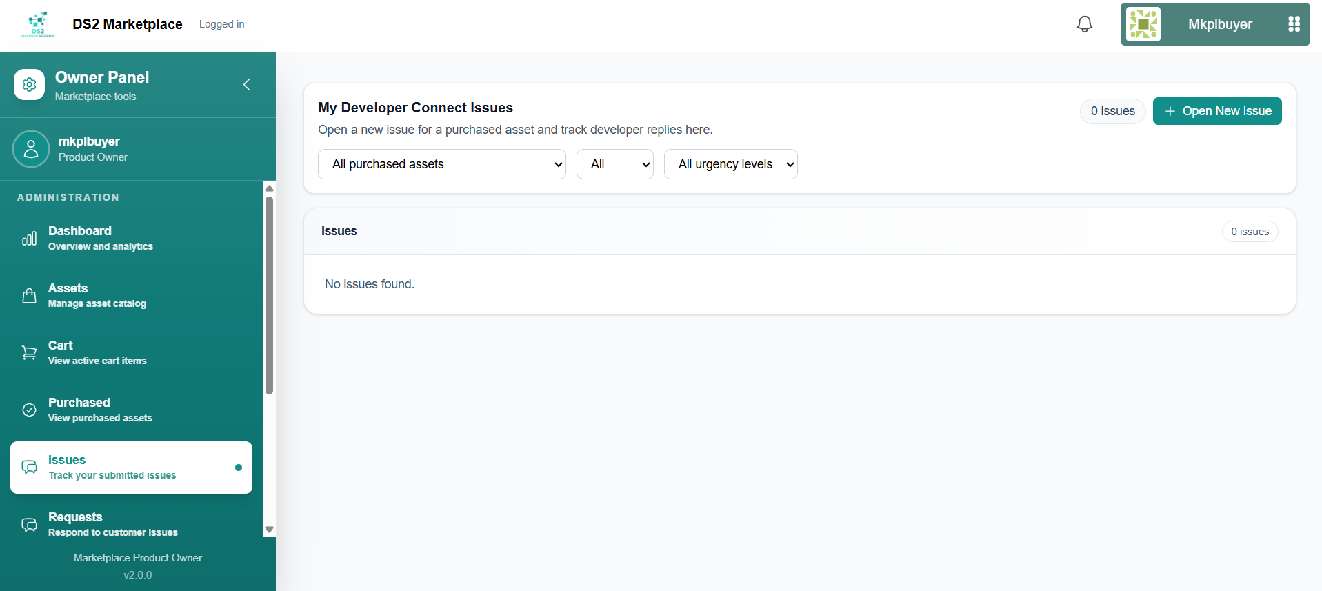
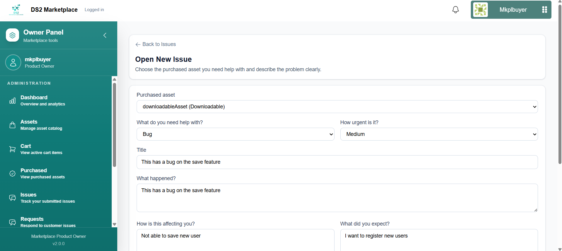
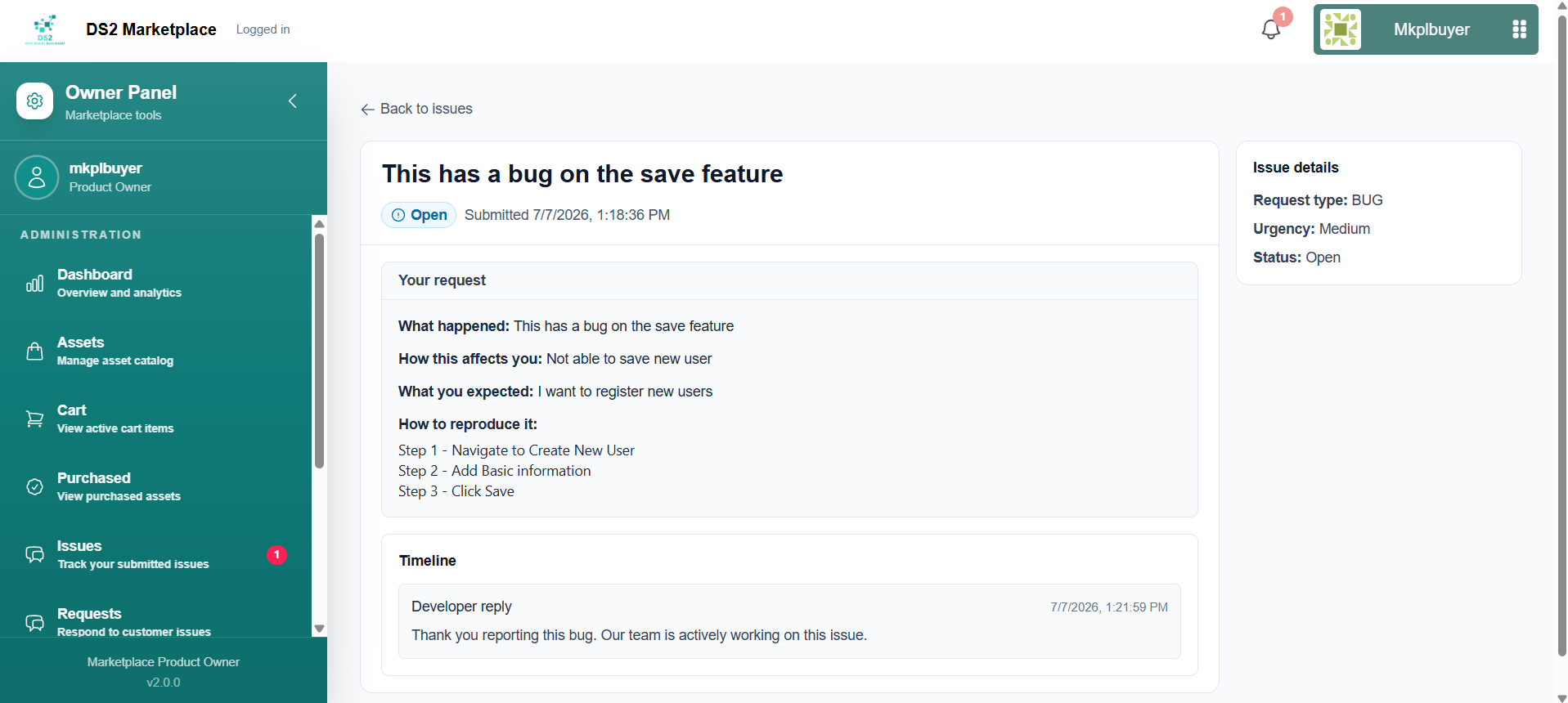
Go to Issues and click Open New Issue to report a problem with something you've purchased. Choose an issue type and priority, then click Create Issue. Once created, your issue appears in the Issues list where you can open it at any time to follow its progress as the seller responds via Dev Connect, and track its status there or via the notification bell.
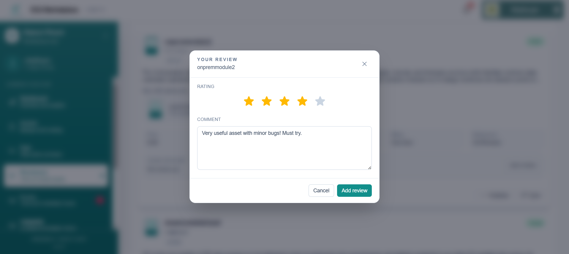
2.7 Rating and reviewing a purchased asset
- Go to Purchased, find the asset, and click Add review (or Edit review if you've already left one for that asset). Choose a star rating from 1 to 5 and, optionally, write a comment about your experience, then submit.
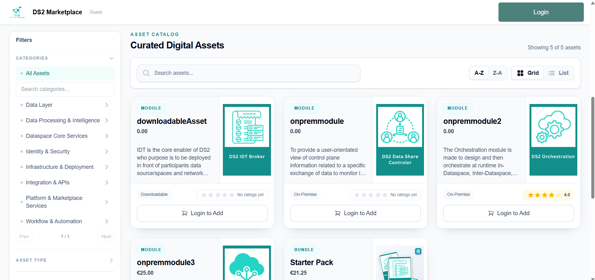
- Your rating updates the asset's average rating, shown as a star badge next to it in the storefront catalog.
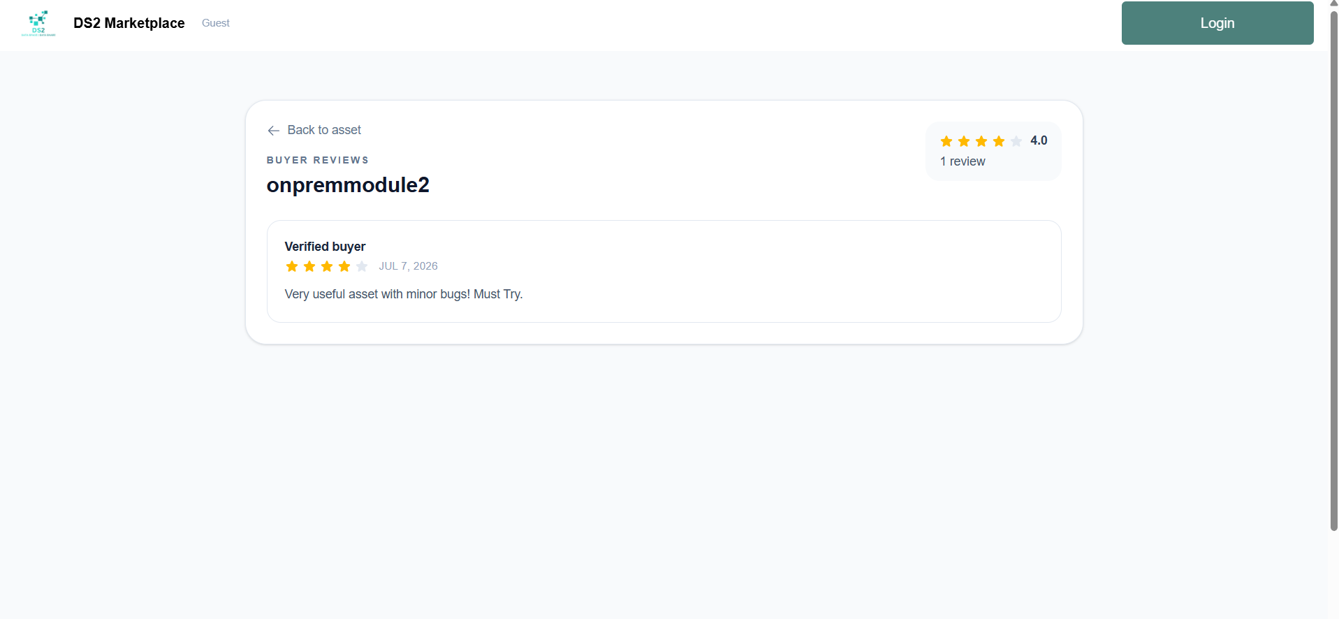
- The asset's detail page shows a Buyer Reviews summary with the average rating and the most recent review.
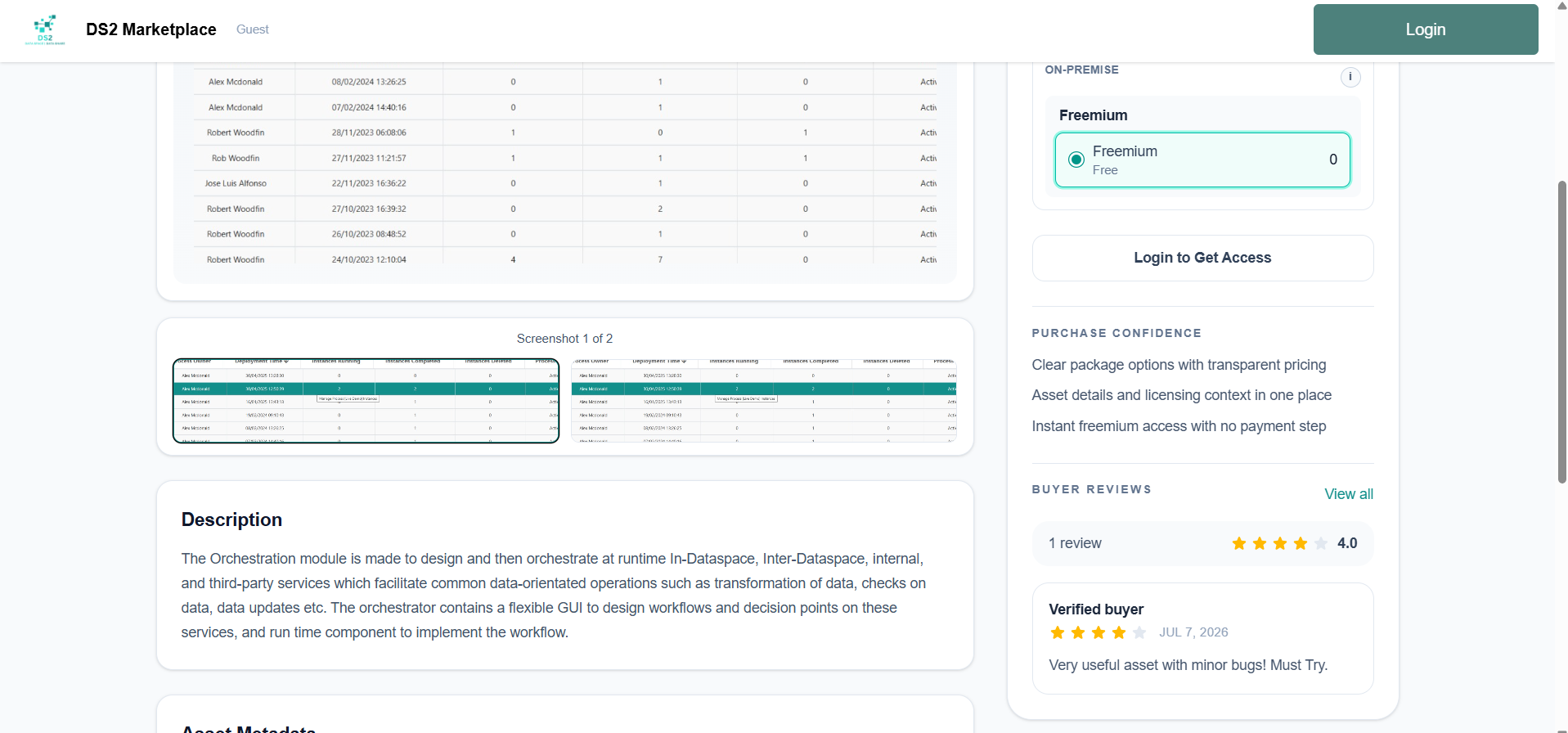
- Click View all to see every review for that asset on its own dedicated reviews page.
3. Admin Guide
Admins have their own dashboard, which includes everything available to sellers plus tools for managing the whole marketplace.
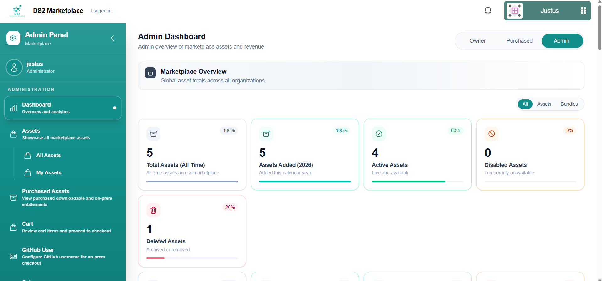
3.2 Platform-wide dashboard
The Dashboard has an extra Admin tab showing marketplace-wide analytics: catalog spread, category coverage, monthly purchases by year, purchase summaries, and rankings by organization.
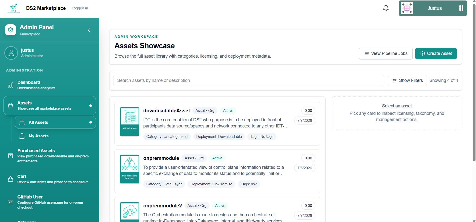
3.3 Managing all assets
Assets → All Assets gives admins visibility into every asset on the marketplace, not just their own.
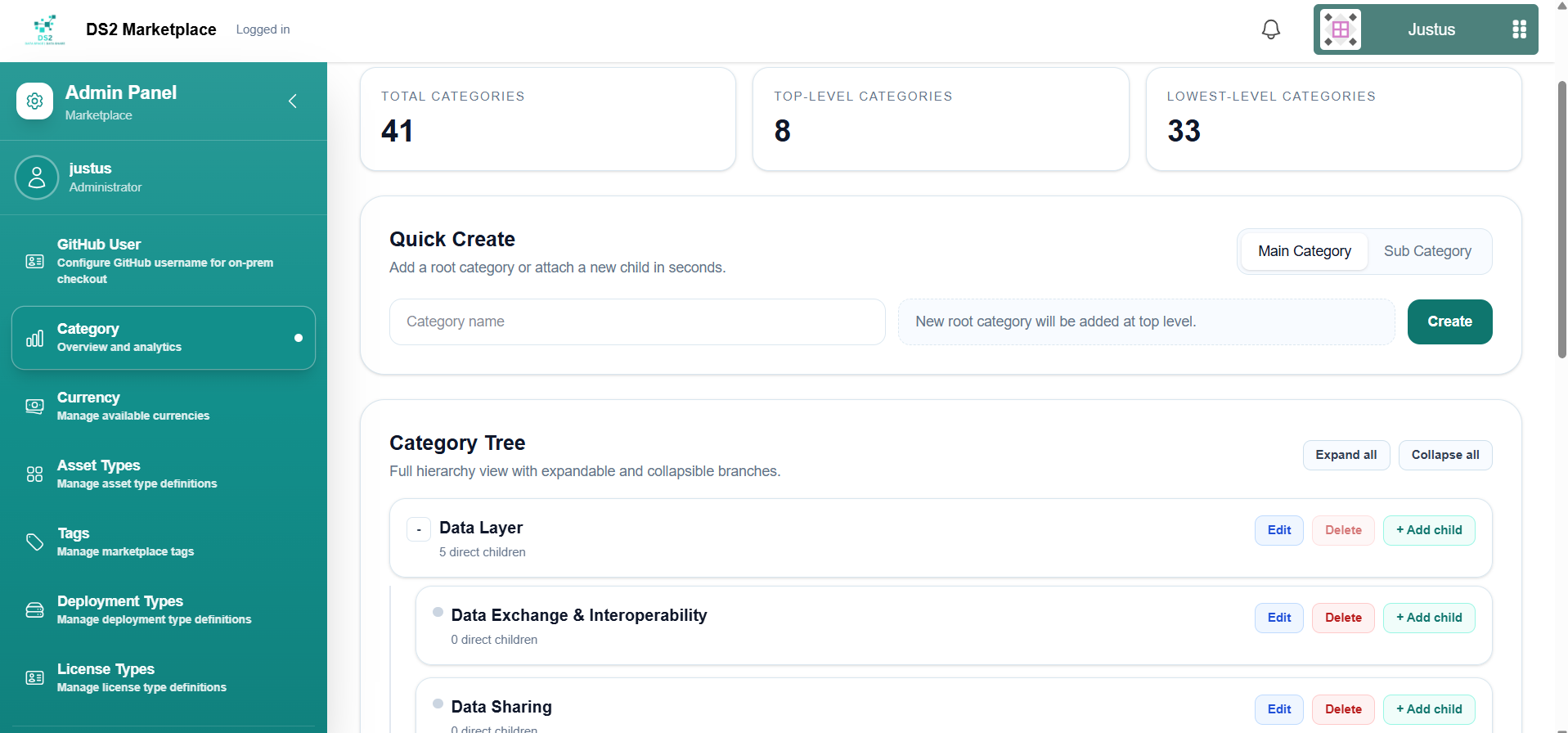
3.4 Managing catalog settings
Use the following pages to manage the shared options that sellers choose from when listing an asset — each has a simple add/edit/delete screen:
- Category
- Currency
- Asset Types
- Tags
- Deployment Types
- License Types
3.6 Other admin capabilities
Admins also have access to Purchased Assets, Cart, and GitHub Access pages, which work the same way as described in the Buyer and Seller guides above, but for the admin's own account.
Dash Button
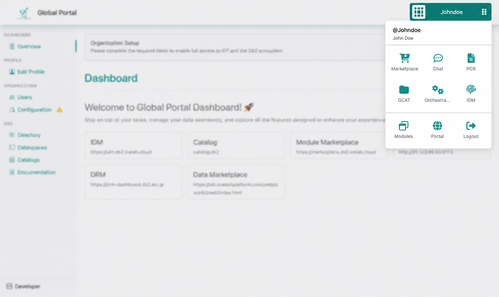
The Dash Button provides a convenient way for users to navigate between installed modules by displaying a pop-up dialog containing the list of available modules. In the latest version, Dash Button management is integrated into the Portal Dashboard, allowing administrators to update the default configuration easily without reinstalling or manually modifying the existing setup.
First you click on the dash button, typically in the top right of the navigation bar and the main dialog is displayed which contains
- Info on the current user logged in
- A list of pre-defined modules to be displayed in this main dialog: this list is defined in the portal-api backend and can vary from Global to Local Portal
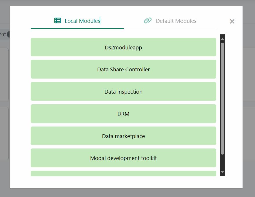
- The Main list which contains a link back to the Portal, the Logout button and the Modules link that displays a second pop-up dialog with the list of modules that the user has available in the Global Portal or the IDT
The next figure shows an example of the main pop-up dialog of the Dash Button in the Global Portal
When clicking on the Modules icon, the second pop-up dialog with the list of available modules is displayed. The next figure shows and example of the Modules pop-up dialog of the Dash Button in the Local IDT Portal.
Other Information
No other information at the moment for Portal
OpenAPI Specification
To Be Done
Additional Links
Video https://youtube.com/portal
Portal Repository https://github.com/ds2-eu/portal (Private Link for Project Members)